Your browser is out-of-date!
For a richer surfing experience on our website, please update your browser. Update my browser now!
For a richer surfing experience on our website, please update your browser. Update my browser now!
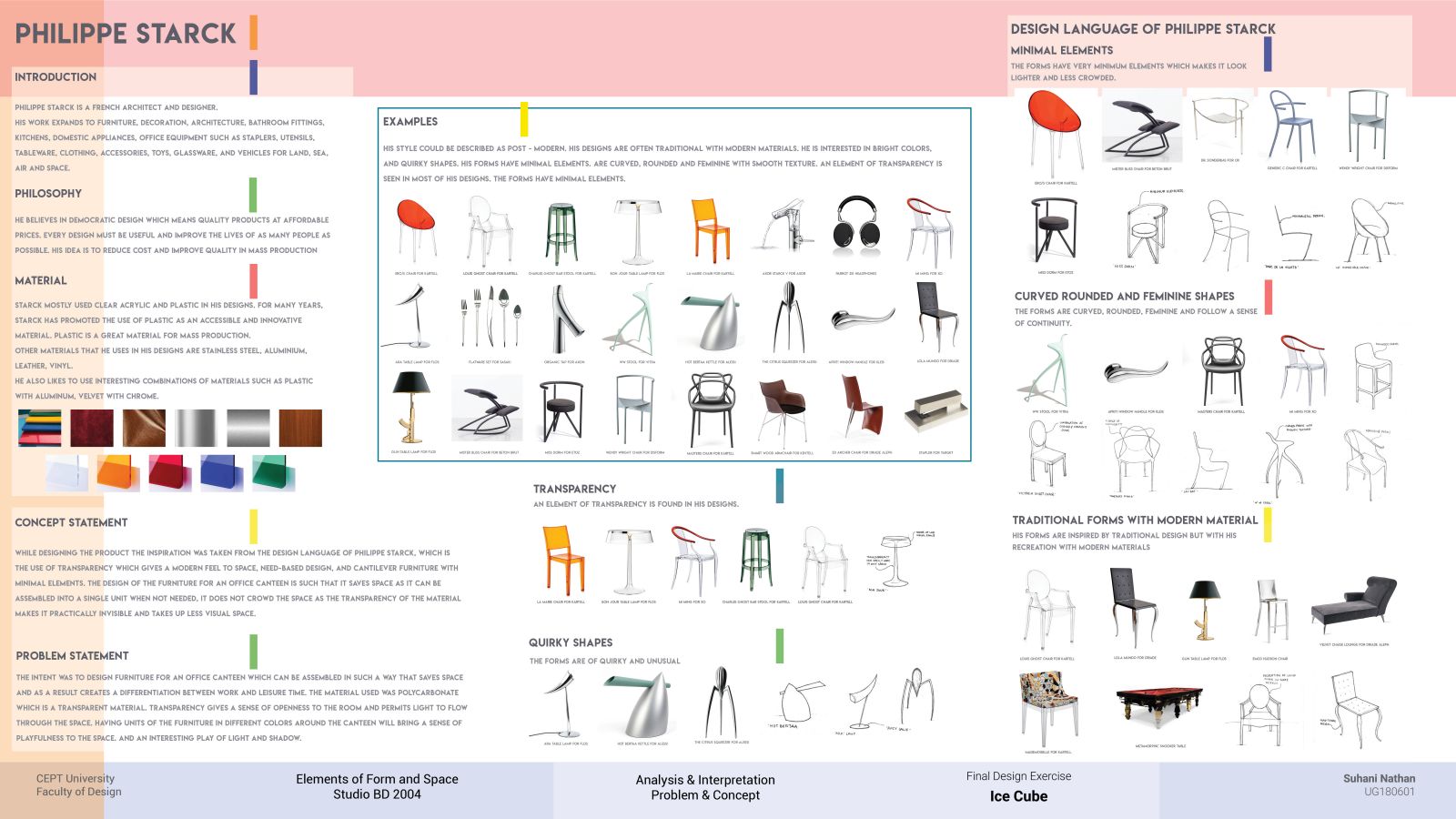
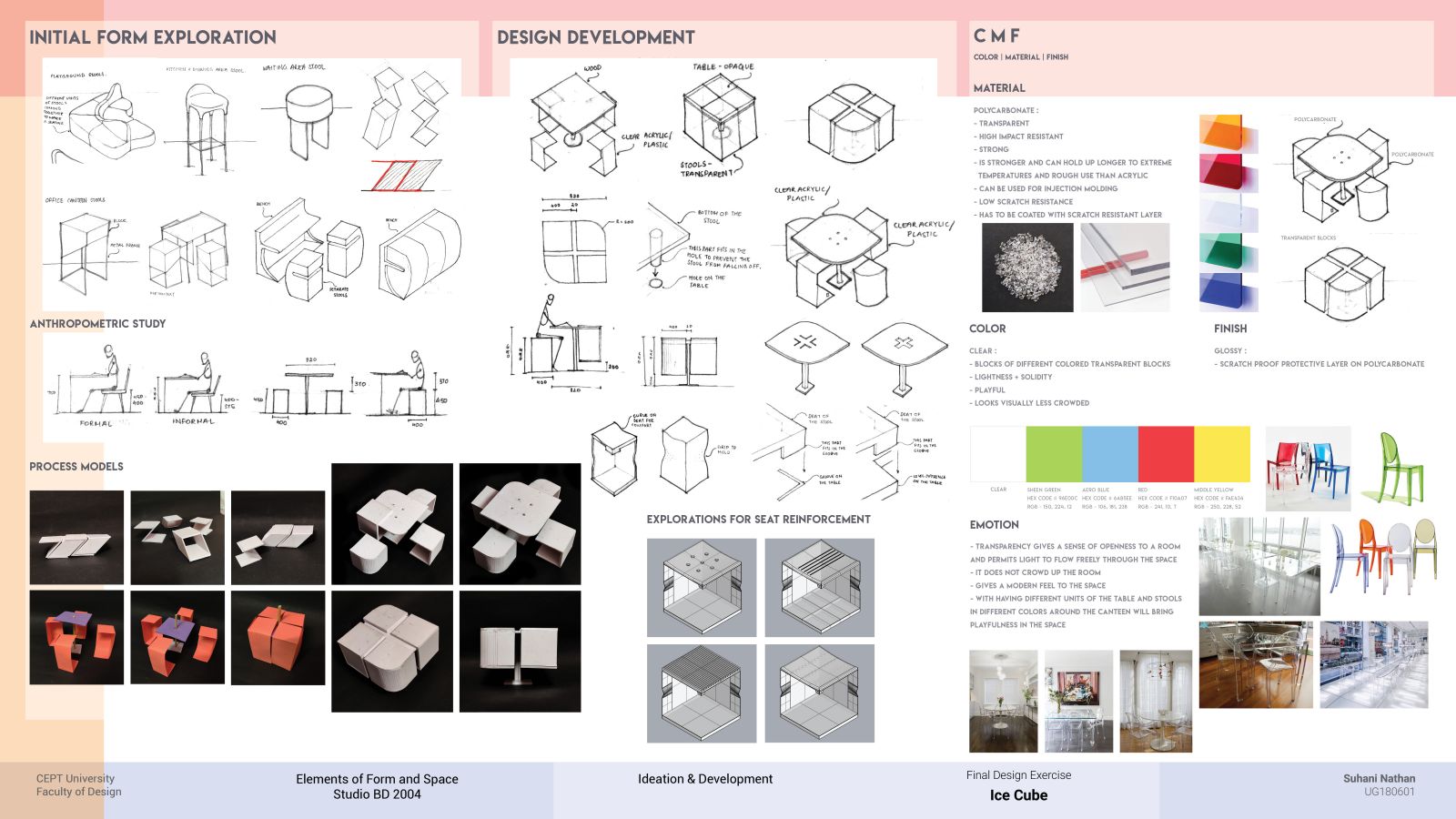
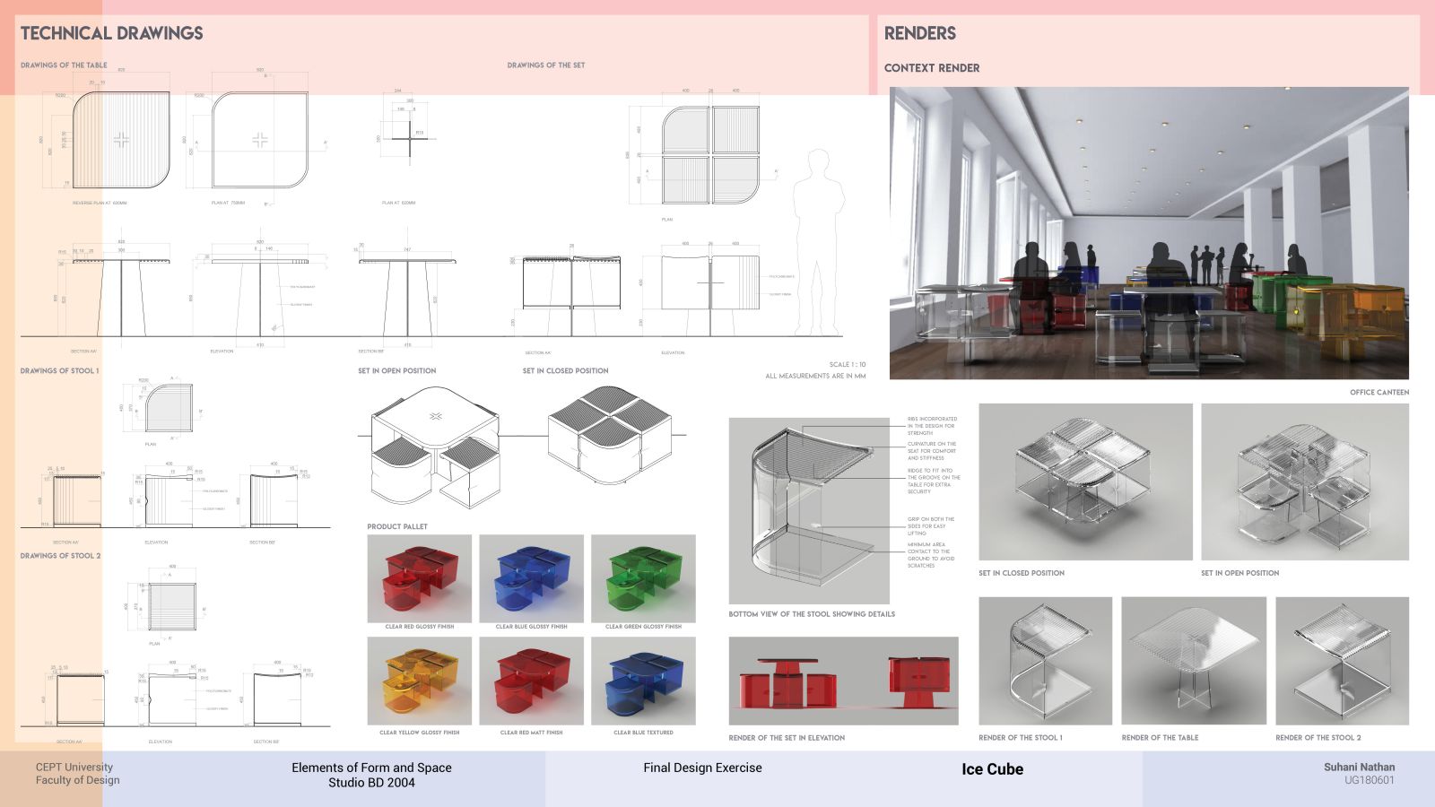
The design brief was to analyse the design language of Philippe Starck by studying his products of different scales and contexts and reading about his ideologies and designing a building product inspired by his design. Ideation of the product started with a single unit of stool in different environments which are playful and modern like a playground, bar, patio. Form exploration started with looking for humor in design as done by Philippe Starck in many of his designs. That came to a form that consists of four stools and a table which when not in use can be assembled into looking like an "Ice Cube" because of the form and material. Then more details were worked out for the injection molding process to achieve a monolithic form.
DESIGN INTENT
The intent was to design furniture for an office canteen which can be assembled in such a way that saves space and as a result creates a differentiation between work and leisure time. The material used was polycarbonate which is a transparent material. Transparency gives a sense of openness to the room and permits light to flow through the space. It does not crowd the space and makes the product practically invisible. Having units of the furniture in different colors around the office canteen will bring a sense of playfulness to the space.
MIRO BOARD LINK (check out the whole timeline of the studio here)
https://miro.com/app/board/o9J_ldJ0VUw=/
FULL PORTFOLIO LINK
https://drive.google.com/file/d/1iQAHJTcGFqGxU_mnikioVWXAaFPhND72/view?usp=sharing


