Your browser is out-of-date!
For a richer surfing experience on our website, please update your browser. Update my browser now!
For a richer surfing experience on our website, please update your browser. Update my browser now!
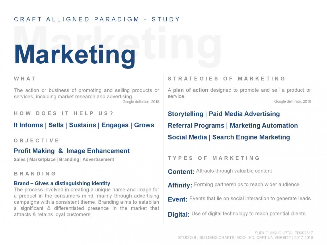
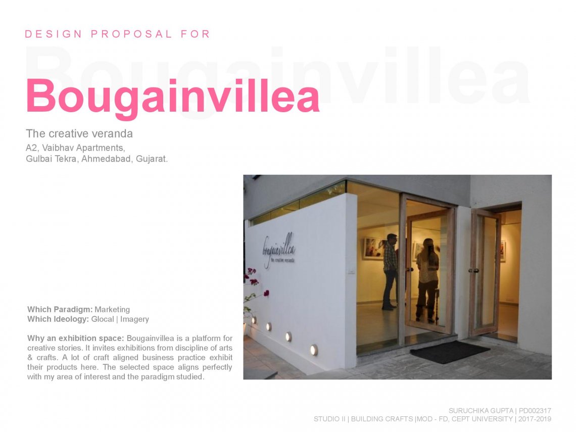
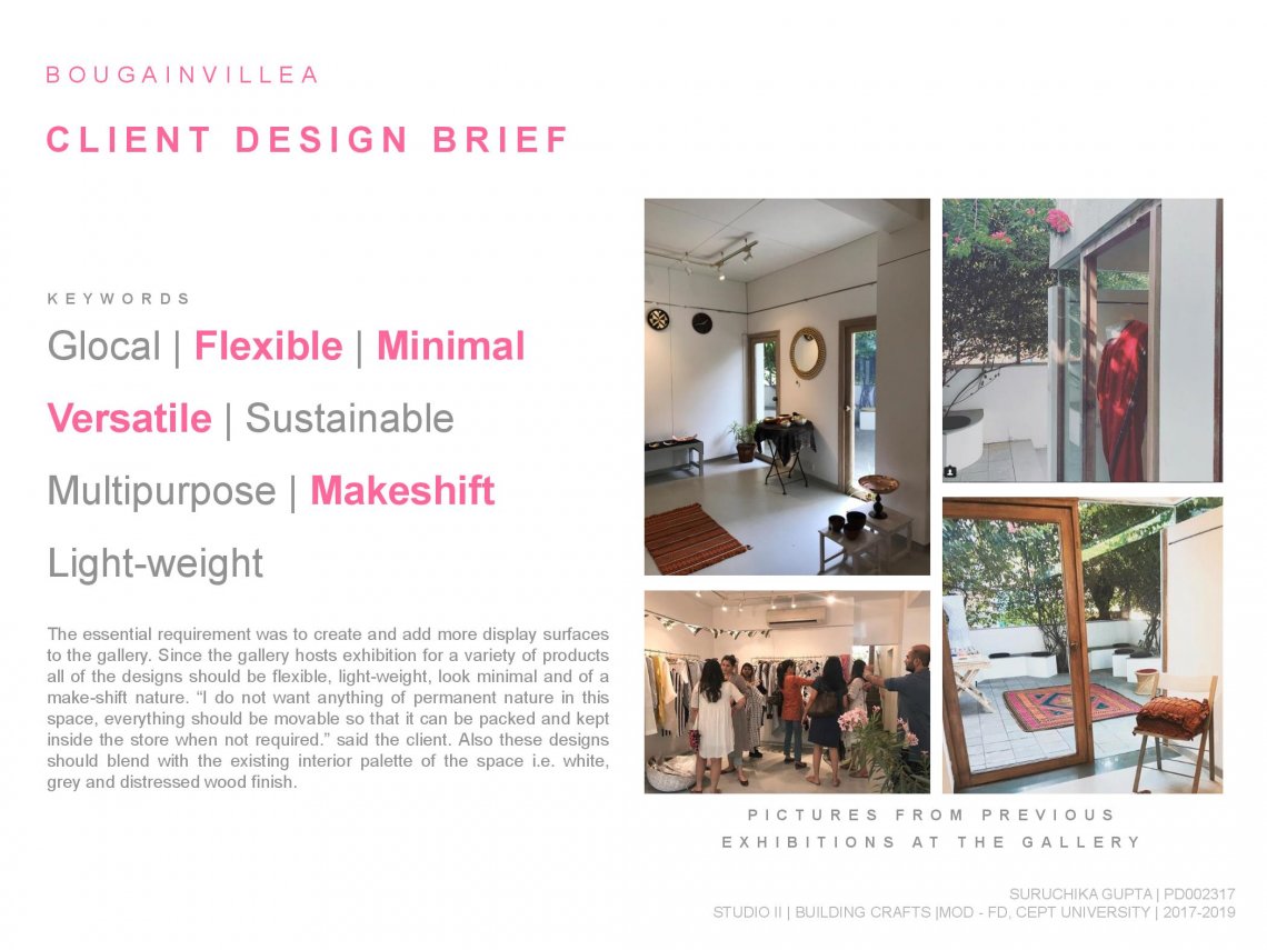
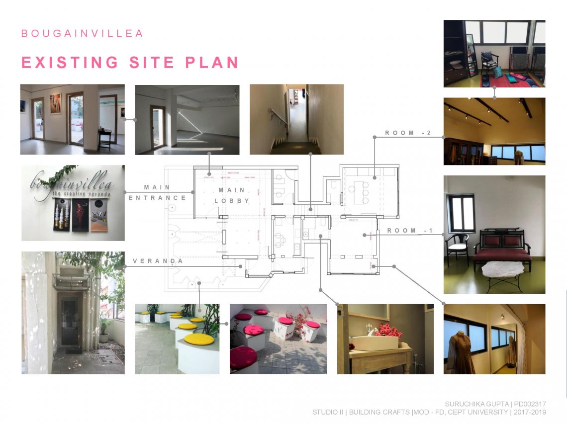
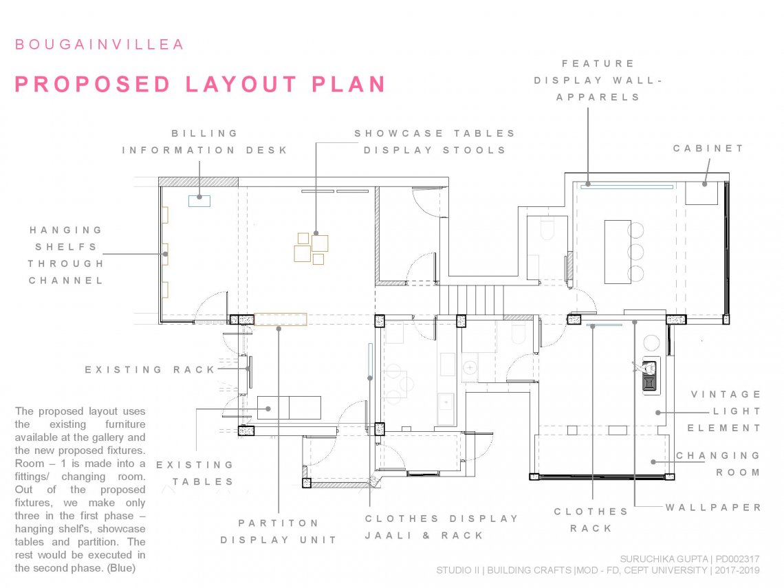
The studio started with the ‘search’ and ‘understanding’ of the concepts related to craft to critically examine what constitutes the craft sector and its different facets. The exercise started with students’ brainstorming through mind maps, which were further branched into broader categories. The mind maps were extensively developed iteratively, where key concepts were simplified and elaborated in order to arrive at a conclusion. These categorizations were further revised based on paper readings by the students which were followed by debates on key concepts and forming a collective and individual understanding. From the many sub-categories identified from the mind map, 10 primary factors were selected to be studied as paradigms. Every student then researched on individual paradigms and made presentations for the same. The second part of the exercise was to look for design practices, and study the ‘paradigms’ that they follow. The categorization process was indeed intensive and in depth. The process was redone and reviewed several times by student and faculty discussions and debates. Understanding the paradigms and evaluating design practices, helped the students not only to broaden their knowledge but to also be able to situate their position in the craft sector, for the current semester studio project and future. Paradigm is a ‘subconscious’ construction of ‘mass mind’. It is a ‘typical model’ and a collection of commonly accepted ‘concepts’, ‘assumptions’ and ‘practices’. It acts as a determining factor for different discourses. Paradigm Studied: MarketingSite & Client: Bougainvillea, the creative veranda | Ms. Ishita ParikhWhat: Exhibition space Design
