Your browser is out-of-date!
For a richer surfing experience on our website, please update your browser. Update my browser now!
For a richer surfing experience on our website, please update your browser. Update my browser now!
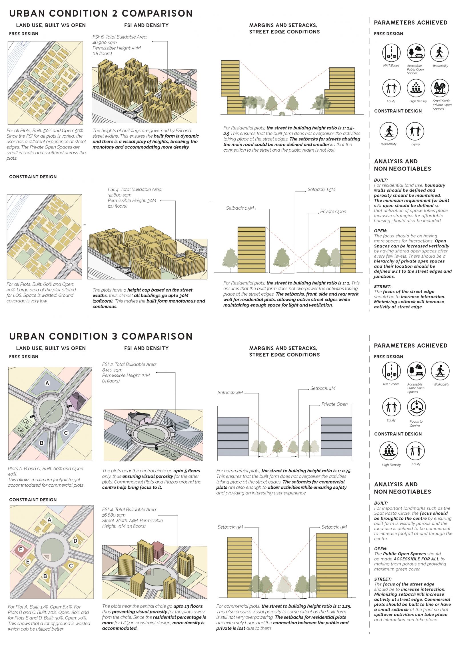
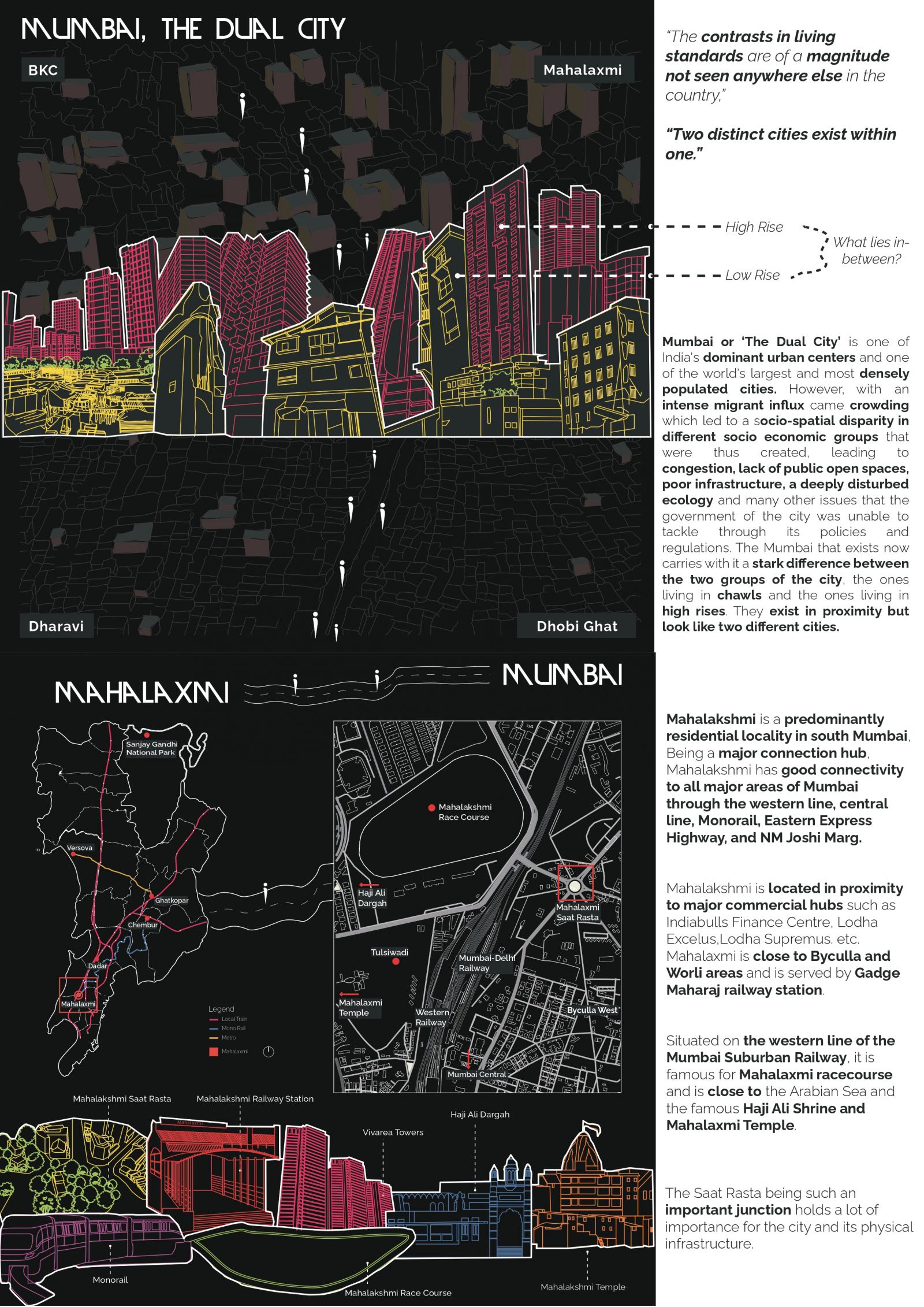
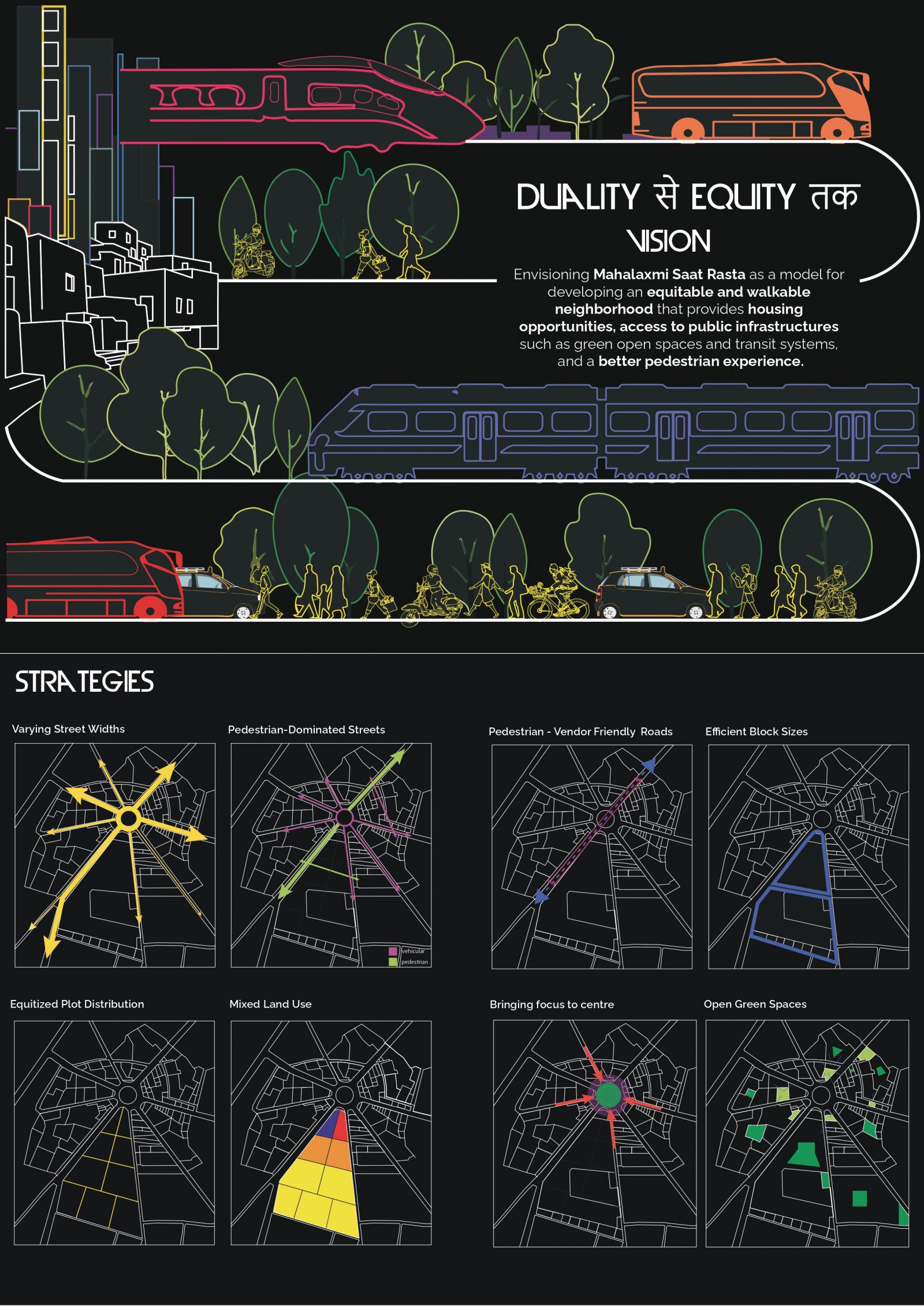
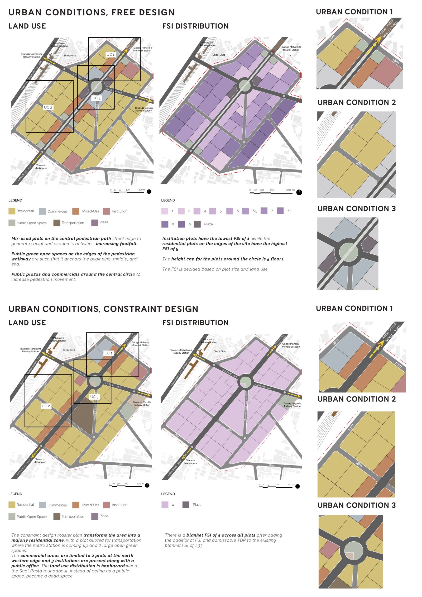
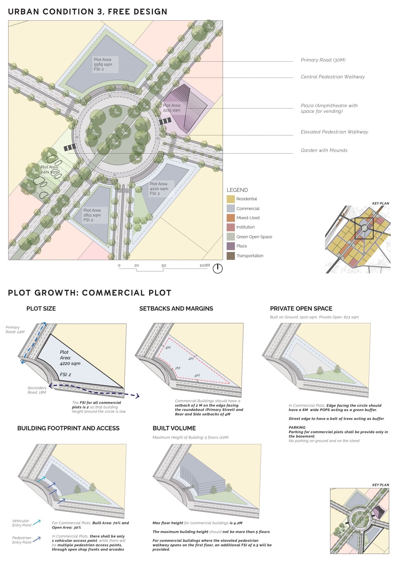
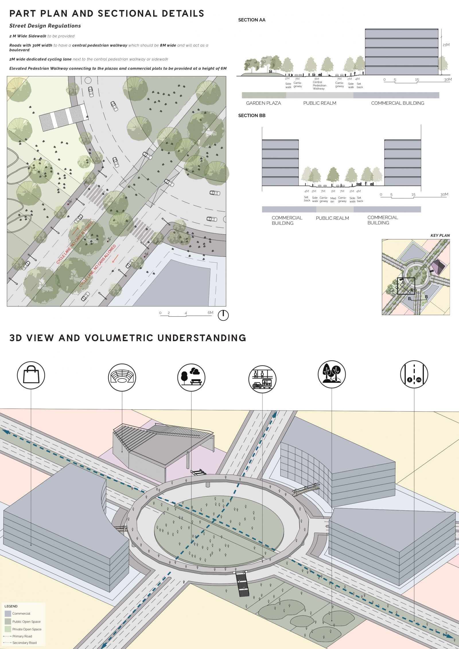
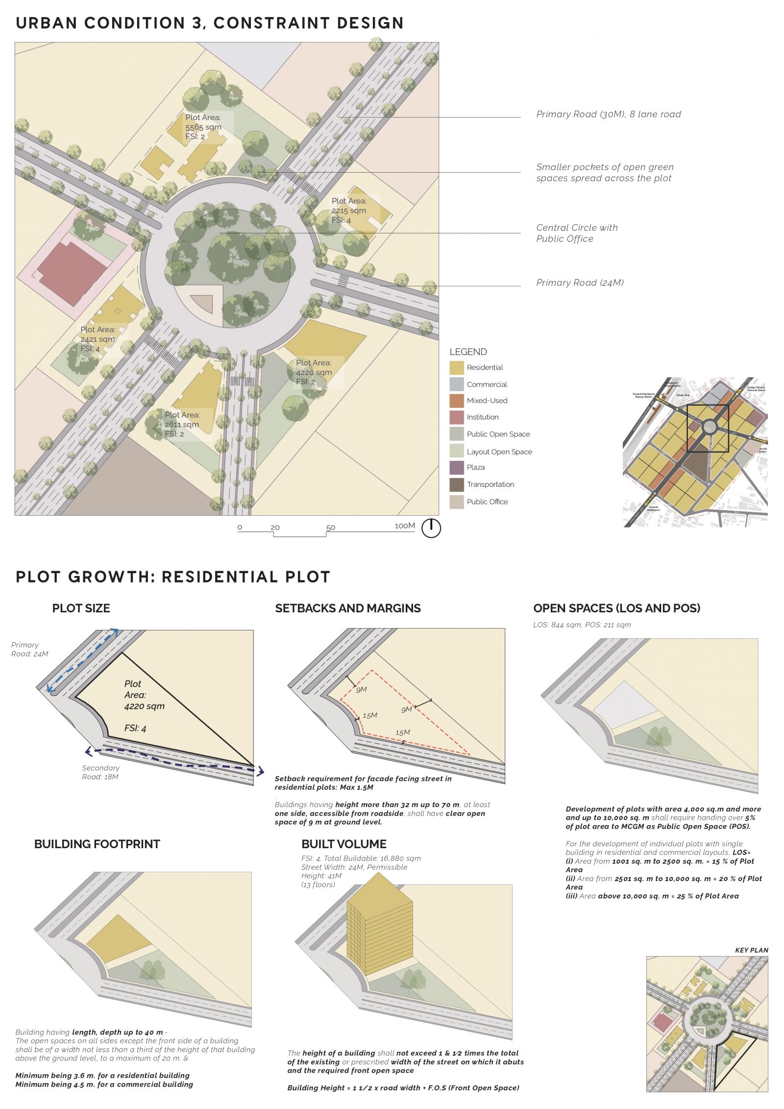
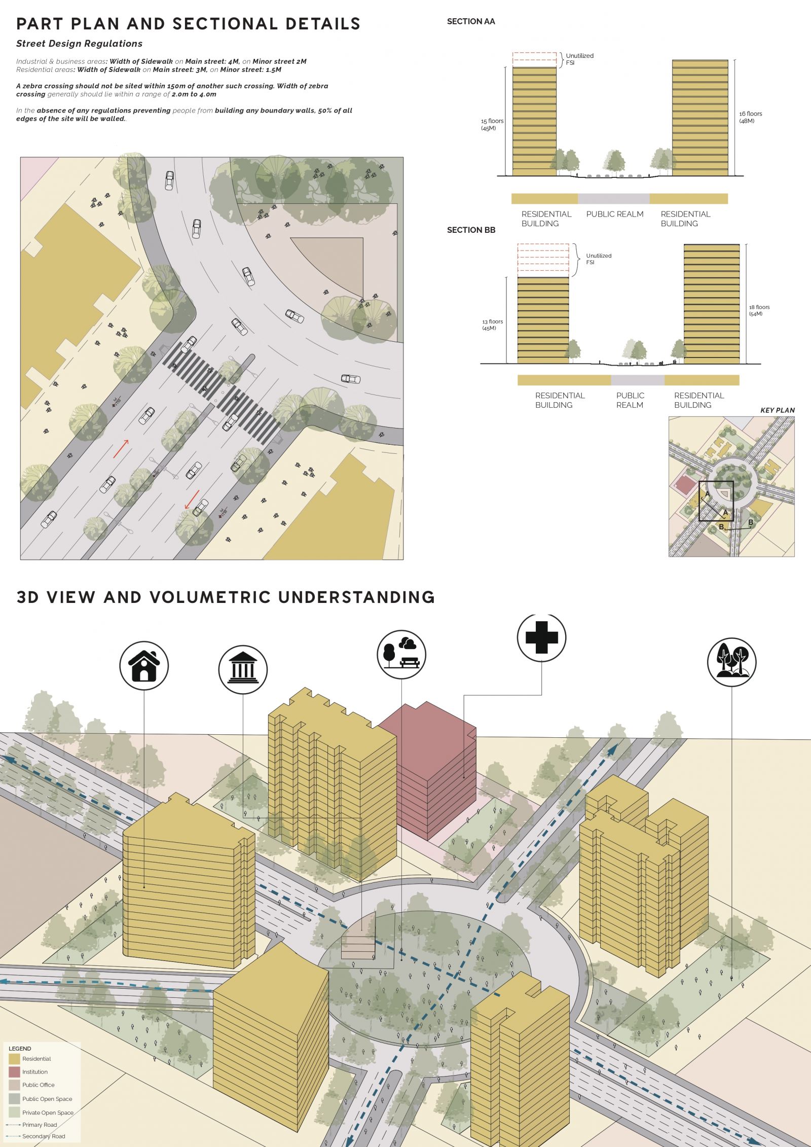
The city of Mumbai, with its contrasting skyscrapers and its chawls presents a lot of challenges to us as urban designers. Through designing the site of Mahalaxmi, what was inferred was that we have to prioritize and strategize, what is it that we are designing, and who are we designing for? The major issue that we identified was the huge socio-economic disparity that existed on site resulting in a socio-spatial disparity which reflected in the way spaces were used by different user groups. This led to duality on site, where a stark division was observed. The manifesto was developed with the idea of bringing equity by using different strategies that would cater to all user groups while being sensitive to the context of Mahalakshmi and keeping in mind the three transit stations present on site. Strategies used in the master plan include removing three roads which led to inefficient block sizes and defining a street hierarchy in order to define block sizes according to minimum walking distances. The land use was distributed according to the requirement of the site, with the central idea being to bring focus to the centre and develop it as a commercial hub with maximum pedestrian and vehicular traffic. Link to portfolio
View Additional Work
.jpg)
