Aarya Chandrasekhar

CFP004

UAR20002

The first semester focused on developing drawing and representation skills. Continuing in a similar vein, during the second semester, the CFP Studio component focuses on building analytical abilities. Exercises like mapping and data representation engage with on-ground reality, requiring that the students develop their ability to observe, collect data and analyse it, as well as communicate and represent it meaningfully; building elements and materials allows for initial familiarization with these, theoretically as well as through observation of built spaces around; while making and testing structures uses hands-on experience to enable conceptual understanding. Technical drawing II builds on the skills imbibed initially and develops them towards further complexity. All the exercises find their culmination in tackling a design problem, which brings together the skills and abilities while introducing the students for the first time to the design process. These skills will be put to use during L2 studios, and will be discussed in their relevance to the professional practice that designers, architects and urban planners engage in.

View Additional Work
Report Content

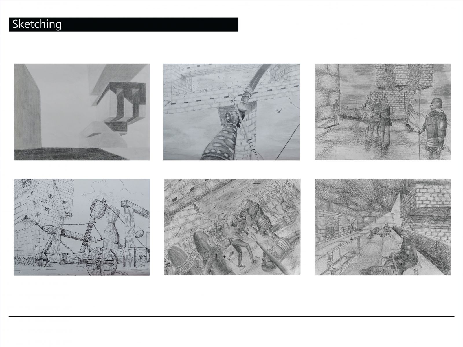
Growing up watching and playing medieval fantasy games, painting a still from a war came to be an obvious choice the moment the last two sketching exercises were introduced. Wars have always been fascinating. So many details and things progressing simultaneously, all for one goal. Catapults, siege towers, ballistae, formations, all had to be incorporated into these sheets. Thus, the ambience of the setting was chosen before the activities. Inspired by movies like lord of the rings and games like skyrim and witcher, my mind already had catalogued over the years dozens of armor sets and siege structures which became easy to draw. The gruesome feel, on the advice of the tutors, is more prominent in the last three sheets. The darkness of the arrow filled sky, the soldier hung from the bridge in the fourth sheet, are among my favourite additions, accurately enhancing the view being aimed to capture.

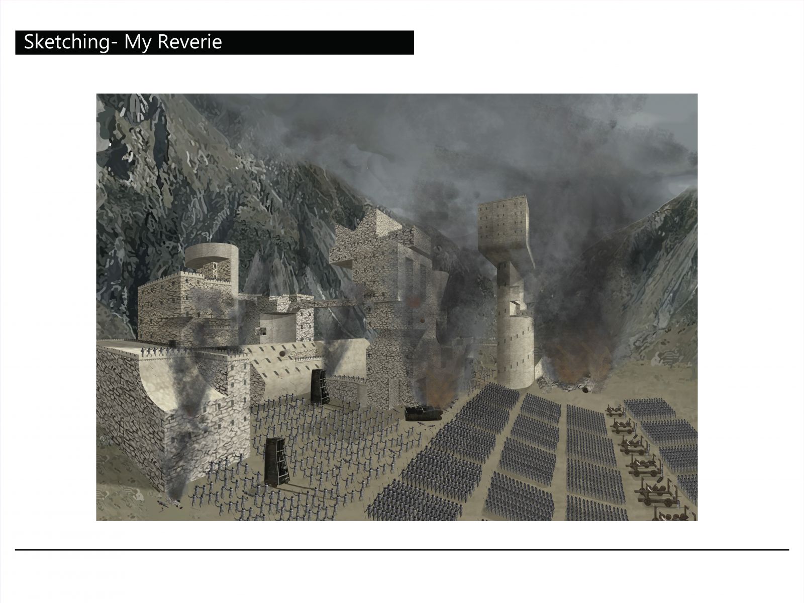
Being a zoomed out view of the sheets in the first slide, the environment was the key feeling to capture for this sheet. The siege of Gondor from Lord of the Rings perfectly captured the image created in my mind, its colour palette inspired the illustration. I hence spent my time recreating the rugged mountains seen from my car during long drives through New Zealand, and walking around the fortresses of Kaer Morhen in Witcher 3 (See mom, video games aren’t that useless!). Photoshop, used for the first time to draw, and its perspective tool were a massive help. All that was to be done was draw 2-d prefabs and warp it with the brilliant tools at one’s disposal. But still, due to limited time, several improvised portions had to be scaled back including flying ships, ballistae, army encampments and a dark gray river full of blood and floating bodies.

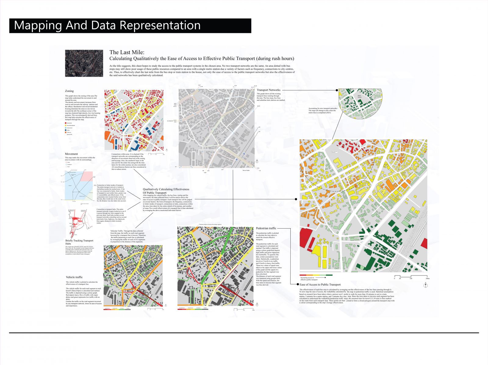
Playing sandbox city-design games for the past 5 years, mods made me accustomed to just toggling a button to see the paths of all traffic passing through. This always intrigued me, not only because a computer was able to generate this instantly, but also because this helped to understand movement in the area and accordingly place transport networks. So naturally, I was attracted to this focus on transport when mapping was introduced. Living in South Bombay surrounded by densely packed high-rises and several offices on all sides with two suburban-railway stations 10 minutes away, public transport was a necessity. Due to its high density, every corner of the road had a bus stop. With all its varied forms of transport, I arrived at the data I wanted to map before even deciding the dimensions of the area to be mapped- Calculating the ease of access to the closest effective transport.

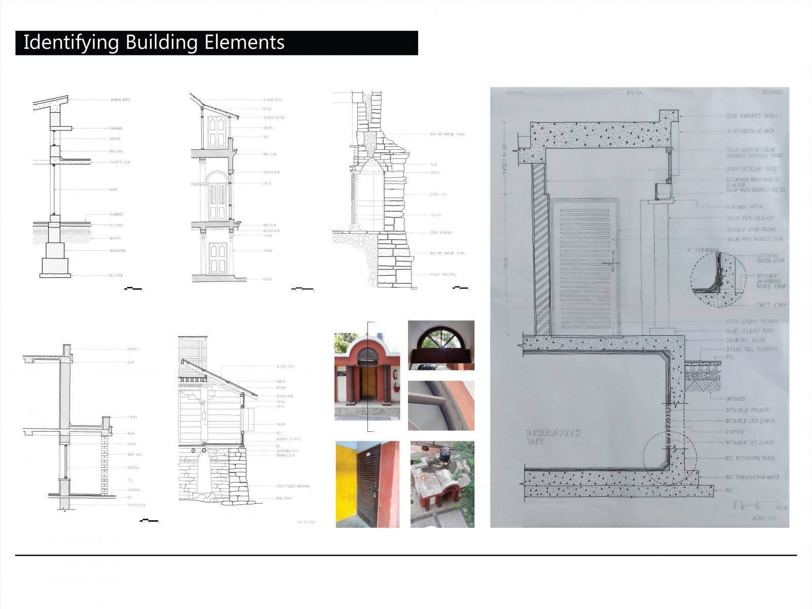
‘More to it than meets the eye’, was my first thought on deciding to draw the wall section of the pump control room of the building. A noticeably odd thing above the ground was the window frame without a glass pane, and the offset of the two pillars holding the curved roof. Seen only as a simple single floor in the image, the catch is realised on walking towards the back of the structure and seeing the massive pipes and drain covers. The room was not elevated by a plinth, but rather by an underground tank. So, without being able to see the foundations, the drawing was done. Ample of research was done into single-storeyed underground tanks. All the waterproofing bitumen layers were marked in appropriate order seen in the expanded view. The foundations and the depth of the tank were educated guesses based on this research.

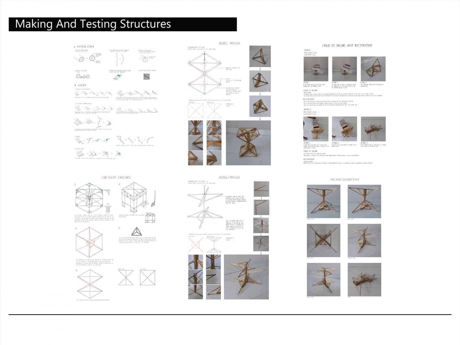
The first structures I conceptualised to handle weight were arches from the four corners formings a cross vault at the centre, similar to Gothic churches I love visiting. But after consulting my tutor, I shifted my focus to a purely engineering direction rather than focusing on aesthetics to see physically, the distribution of weight and their limits. I settled on exploring a cantilevered structure supported by a central main column. The four cantilevers added a bit of redundancy to a structure made out of reed sticks and was perfectly balanced by its centre of gravity. But alas, due to the base of the sixteen sticks not being perfectly level, the structure handled lesser weight than expected. I now know how small things like filing the base could have easily mitigated this, or hacks like using yoga mats to absorb the uneven pressure of the base.

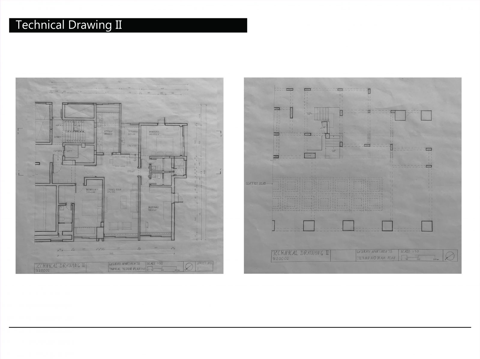
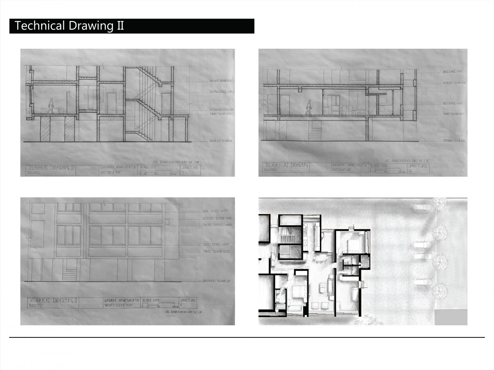
Technical drawing being synonymous with precision, the plans went through multiple iterations to perfect details and lineweights. The mini dustbin on my desk was nearly full with shavings of 2b,2h and 4b pencils sharpened after every three strokes to maintain uniformity. This slow process was weirdly enjoyable, with small amounts of adrenaline coursing through my veins to finish deadlines. The column and beam plan showing the distribution of load was a surprise as I just expected the huge columns at the base to hold the structure, but these did not extend beyond the ground floor. The waffle slab held all the weight of the bottom side as it propagated the load horizontally to the columns, becoming more than just ceiling decoration as I had felt initially. The upper surface is even stranger, held by columns in an irregular grid pattern with the beams doing heavy lifting.

Being the first time doing presentation drawings, I scoured through pinterest and google to understand what are presentation drawings, what are Good presentation drawings and the ways i can represent them. On doing this, I noticed the mistake I made in my first draft, I was just rendering it, not enhancing its effect or readability. Ultimately, I decided to draw a perspective view of the plan, with light grayscale rendering so as to not overpower the drawing, but to still add details like the folds of cushions and beds, the transparency of the table, etc.

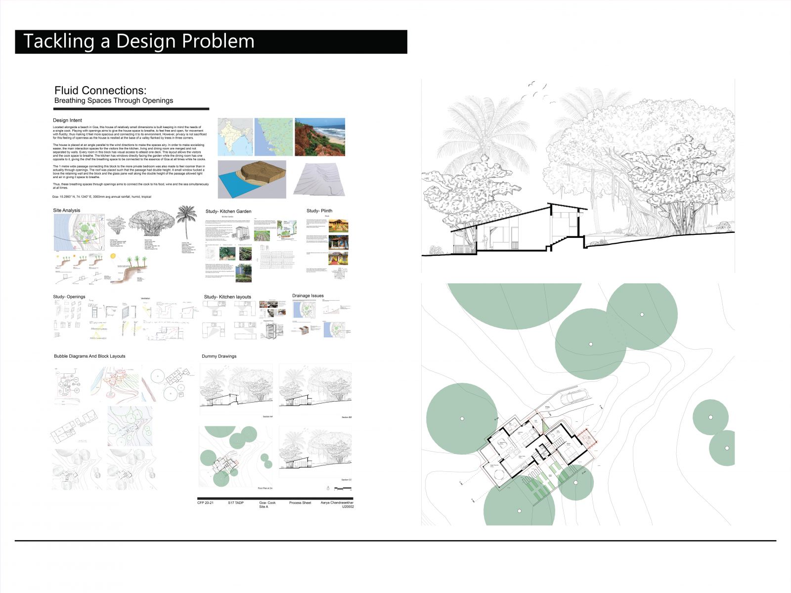
Located alongside a beach in Goa, this house of relatively small dimensions was designed keeping in mind the needs of a single cook. Playing with openings was aimed to give the cook and the house space to breathe, to feel free and open, for movement with fluidity; thus making it feel more spacious and connected to its environment. However, privacy was not sacrificed for this feeling of openness as the house was nestled at the base of a valley flanked by trees in three corners. The valley provided a natural approach to the house which incorporated the contours into its design. This was studied and could be done through either pilotis, plinths at different levels or with retaining walls as seen in the site analysis in the process sheet. Ultimately, without intending to do so, the final design incorporated all three.

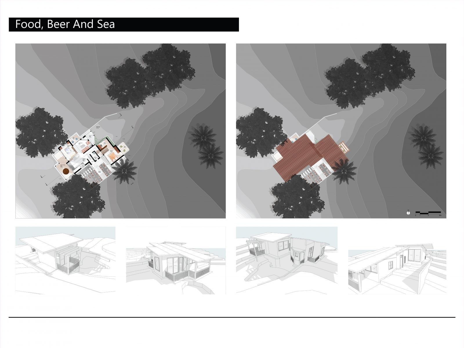
Remembering a certain reference image seen during the previous exercise, my drawing was inspired by its elegant yet not overpowering portrayal of its plan. The materials of each element of the floor was rendered, with the wooden flooring and the tiles done lightly and the furniture more prominent. This interplay between textures was optimised through several drafts, adjusting the lightness, exposure and hue of different elements. Slight shadows were added to enhance the effect. To keep the house plan the focus of the drawing, the contours and trees were switched to grayscale after trying several types of colours including green, brown and orange to give this result. The roof was taken as a simple skillion roof, with its minimalistic design lacking joists and rafters matching the simple white framed windows seen in the next slide.

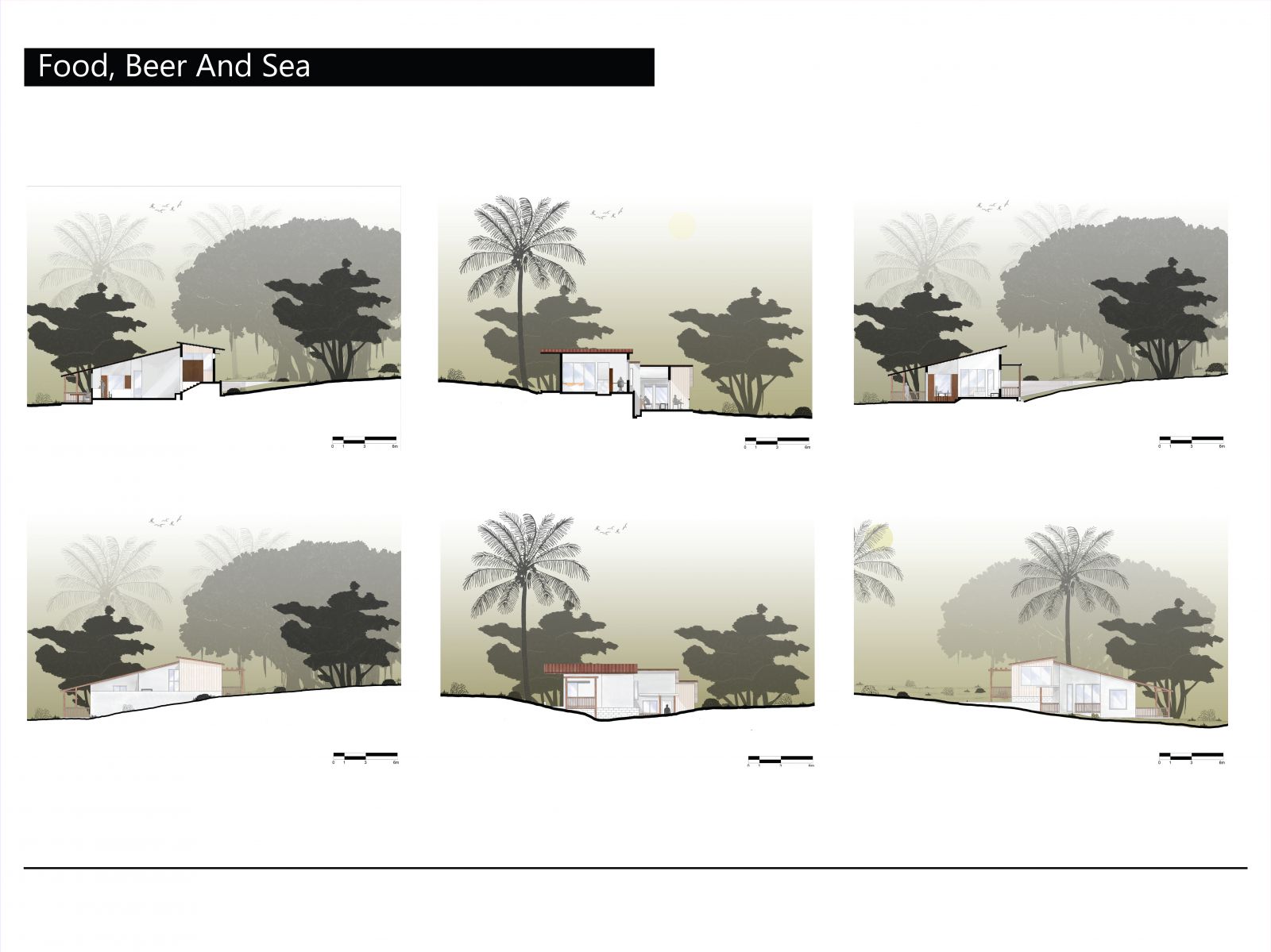
Continuing the same style seen in the plans in the previous sheet, I decided to render the sky instead of the ground to prevent the sheet from being oversaturated with grays. A light yellow- gray gradient was applied. Due to the numerous drafts went through in the floor plan, rendering the sections and elevations were fairly easy, with palettes and textures already set. One major unexpected benefit throughout the entire exercise was me drawing a detailed sketch of all the trees found in the area seen in the process sheet in slide 8. This helped me just copy paste the sketch to all section and elevation drawings, including dummy drawings and presentation drawings.