Aarya Chandrasekhar

CFP001

UAR20002

The Monsoon Semester of the CEPT Foundation Programme inculcates foundational design skills through sequential exercises focused on perfecting freehand and perspective drawing, visualizing and drawing complex compositions. Students learn to make technical drawings using orthographic projections, surface development and exploded views of complex objects; develop the skill of estimating sizes and begin to engage with anthropometrics. Ordering principles, colour theory, imaginative drawing and deciphering and interpreting styles help them develop more complex skills. Alongside, parallel exercises focus on describing objects and presenting their own work in writing, while guest speaker lectures offer exposure to other disciplines.

View Additional Work
Report Content

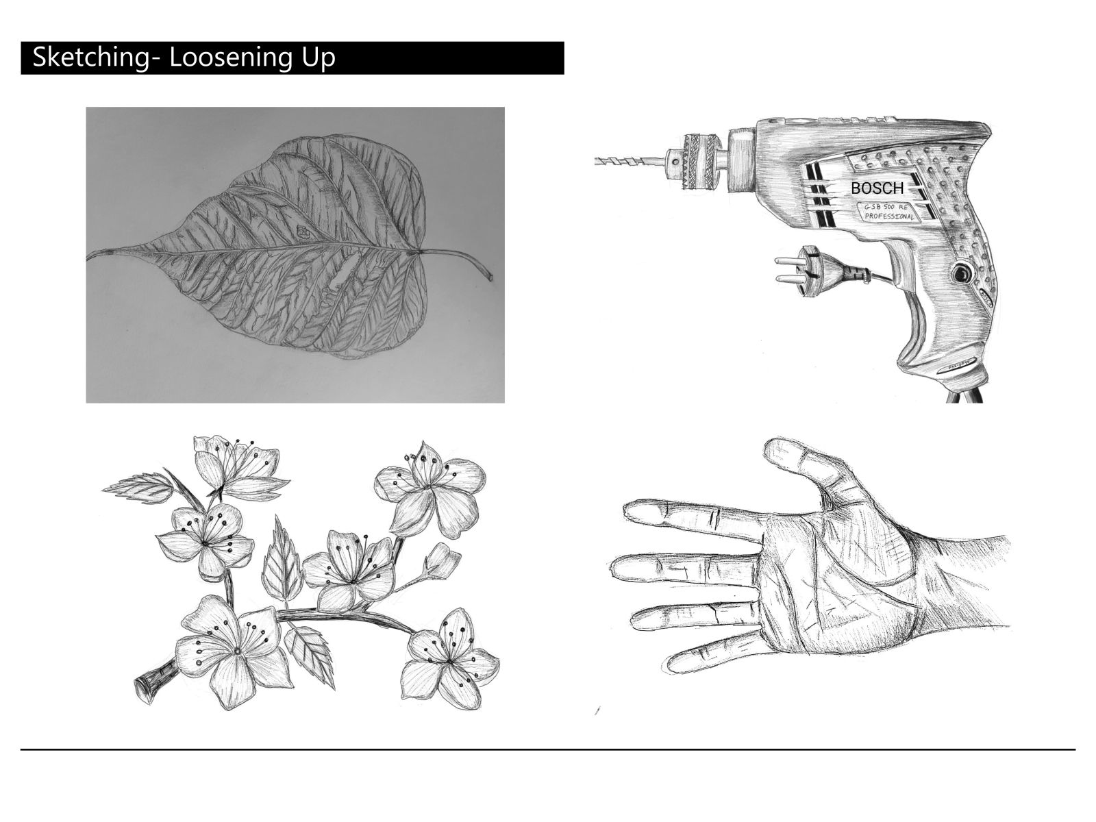
This sheet involve sketches done in the first two weeks which include- leaves, household objects, limbs, interior spaces. We had to observe and convey the minutest of details through our sketches. I use these objects daily but overlooked many of its interesting designs. My brain would just confabulate these tiny details, but I learned I was wrong. These details along with the shading techniques taught to us gave my drawings a breath of life.

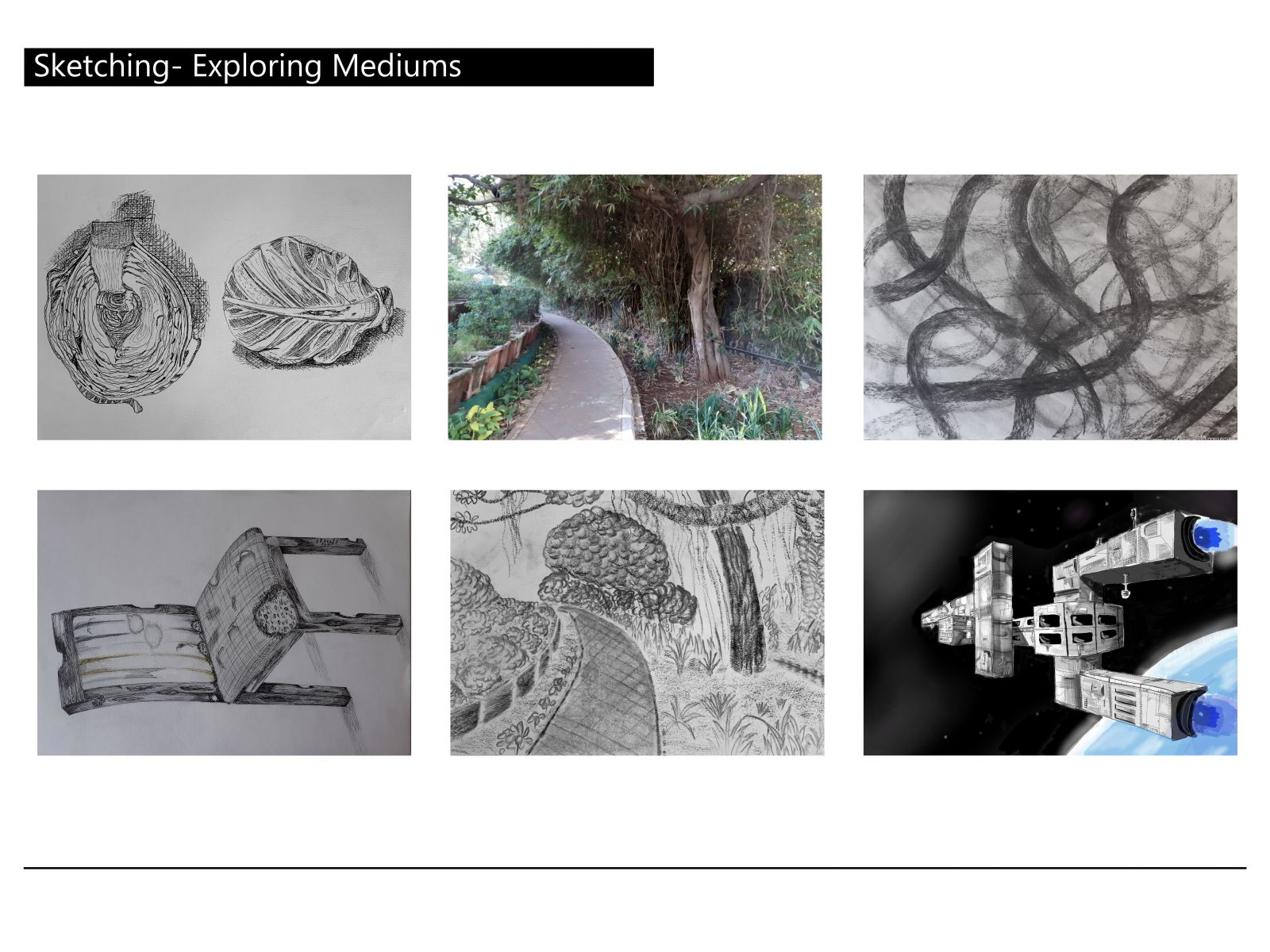
This image shows my foray into sketching with different mediums. A cabbage with pen, a park walkway and an abstract sketch with charcoal, and a chair left in a house for 10 years is found here. The last sketch is of a composition of three letters arranged as a spaceship in space.

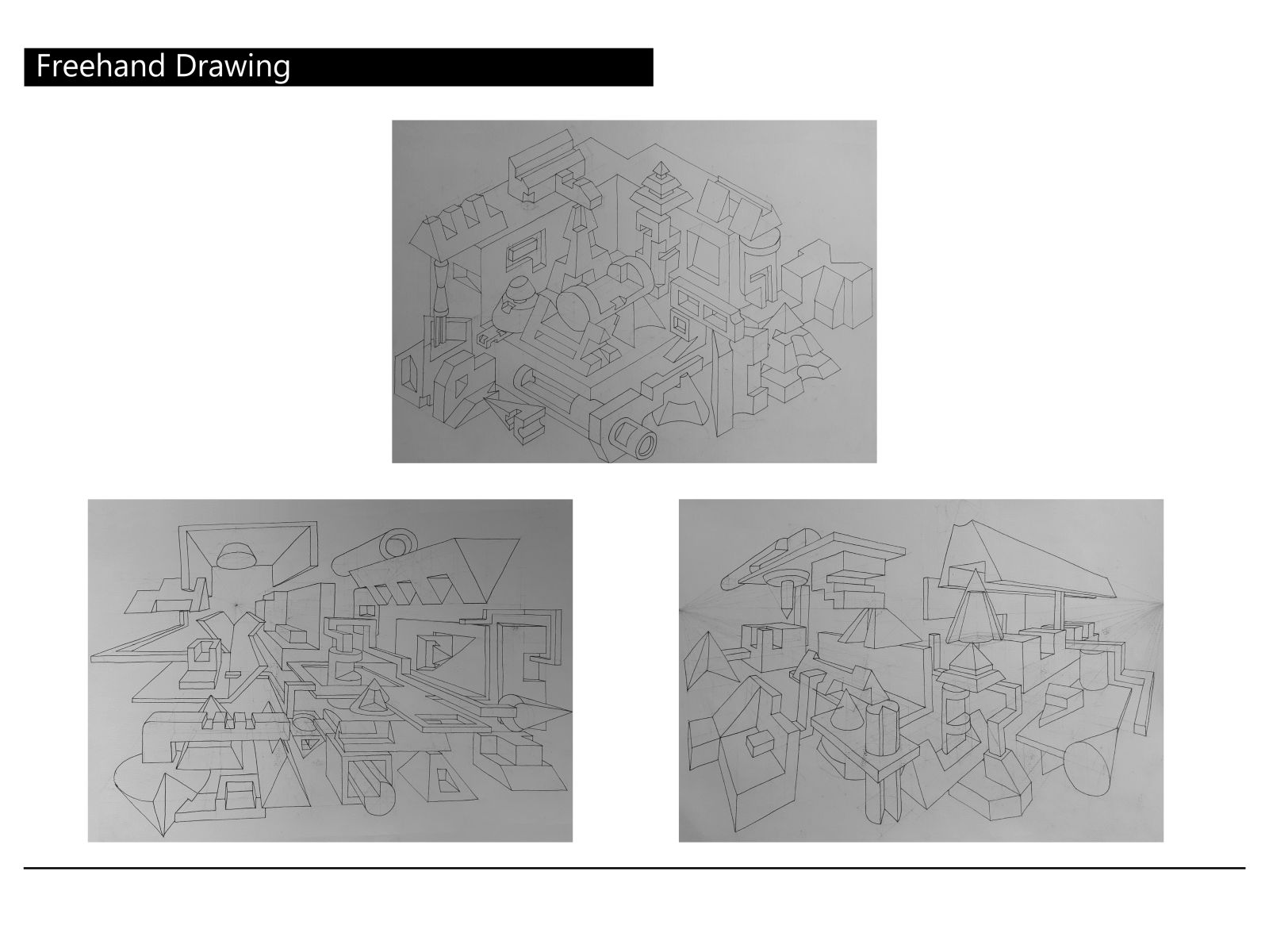
The above image contain freehand drawings. The first one is a composition of 25 subtracted solids and the bottom two are in one-point and two-point perspective respectively.

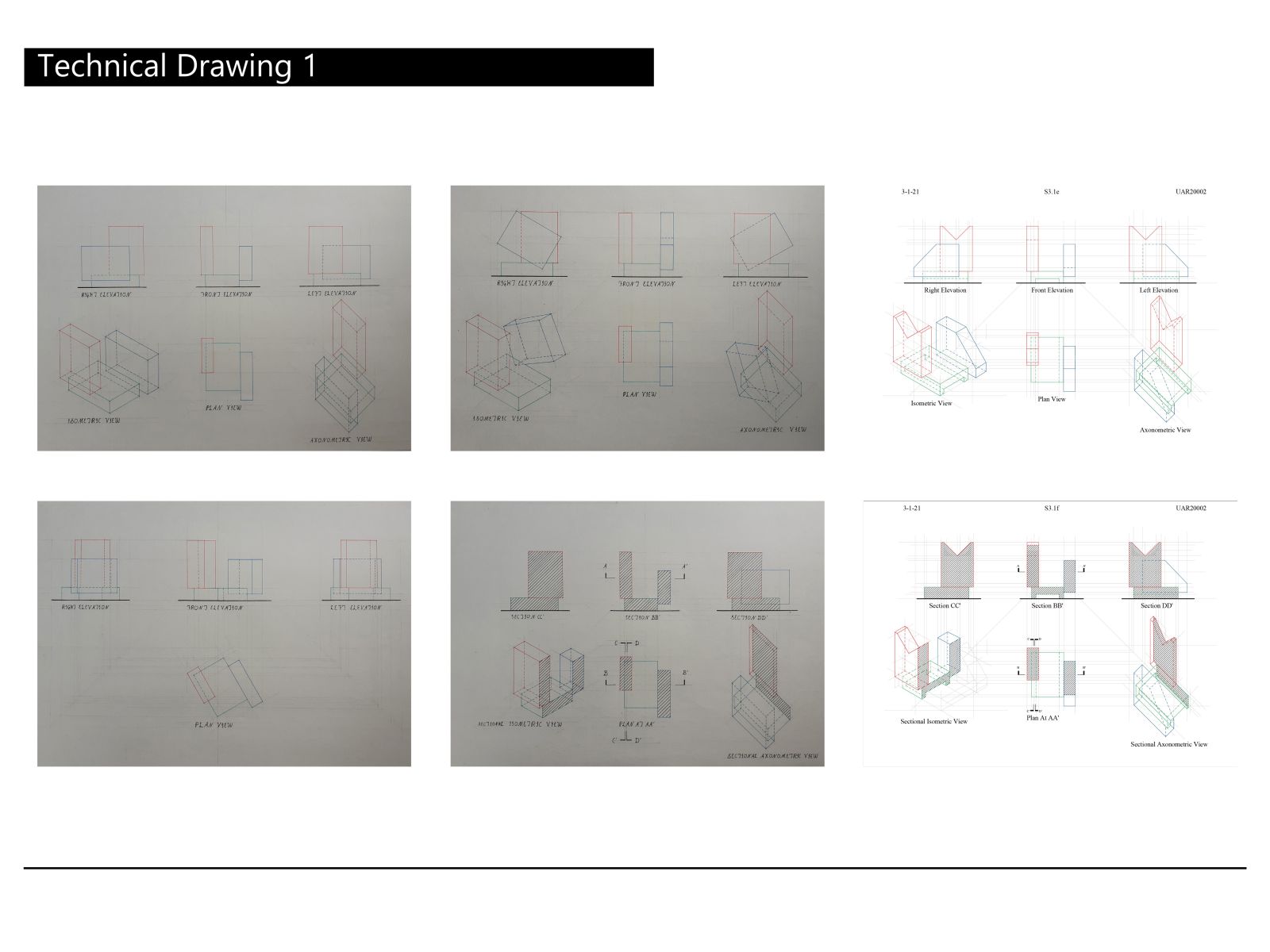
Technical Drawing involved drawing the orthographic projections and isometric, axonometric views of a composition of three matchboxes. The second drawing was when the composition was titled by 30 degrees, the third when one box was at an angle of 30 degrees and the fourth was a section. The last two were drawn in AutoCAD by taking subtractions and its sectional views.

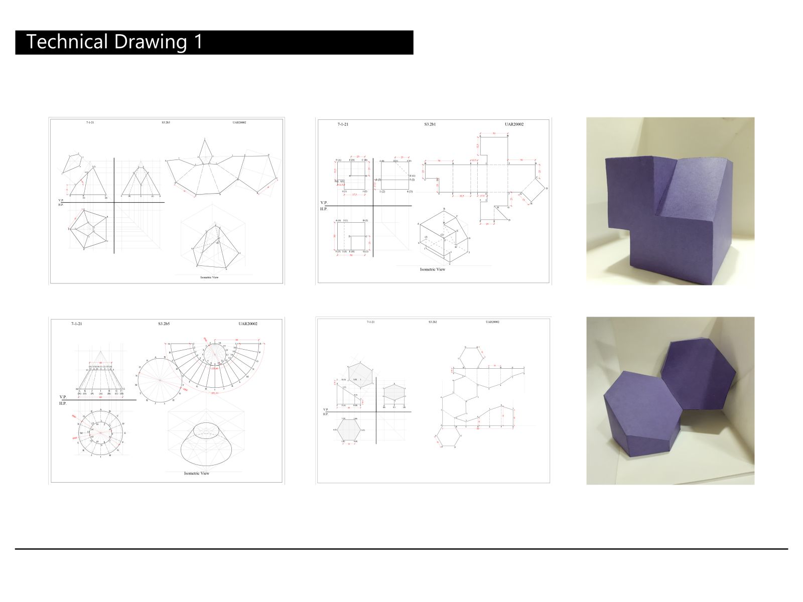
This contains drawings of the surface development of a truncated pentagonal pyramid, frustum of a cone, subtracted cube and a hexagonal prism cut at 30 degrees respectively. Images of the models of the last two drawings have been placed adjacent to them. A sliver of ecstasy courses through my veins while drawing modified forms. Here, one of the modification is achieved by cutting a hexagonal prism at 340. The modification challenges through its cut hexagon, solved through trial-and-error by projecting the slope length of the sliced object. It therefore appears stretched, with side ‘65’ slightly off vertical. The dimensions were to be accurate to the micrometre, the slightest error rendering the entire model wrong. To achieve such precision, Autocad, a drafting software, was used. However, the beauty of technical drawing is that there are several methods other than softwares to verify accuracy; one example being all vertical heights in the right drawing always add to the total prism he

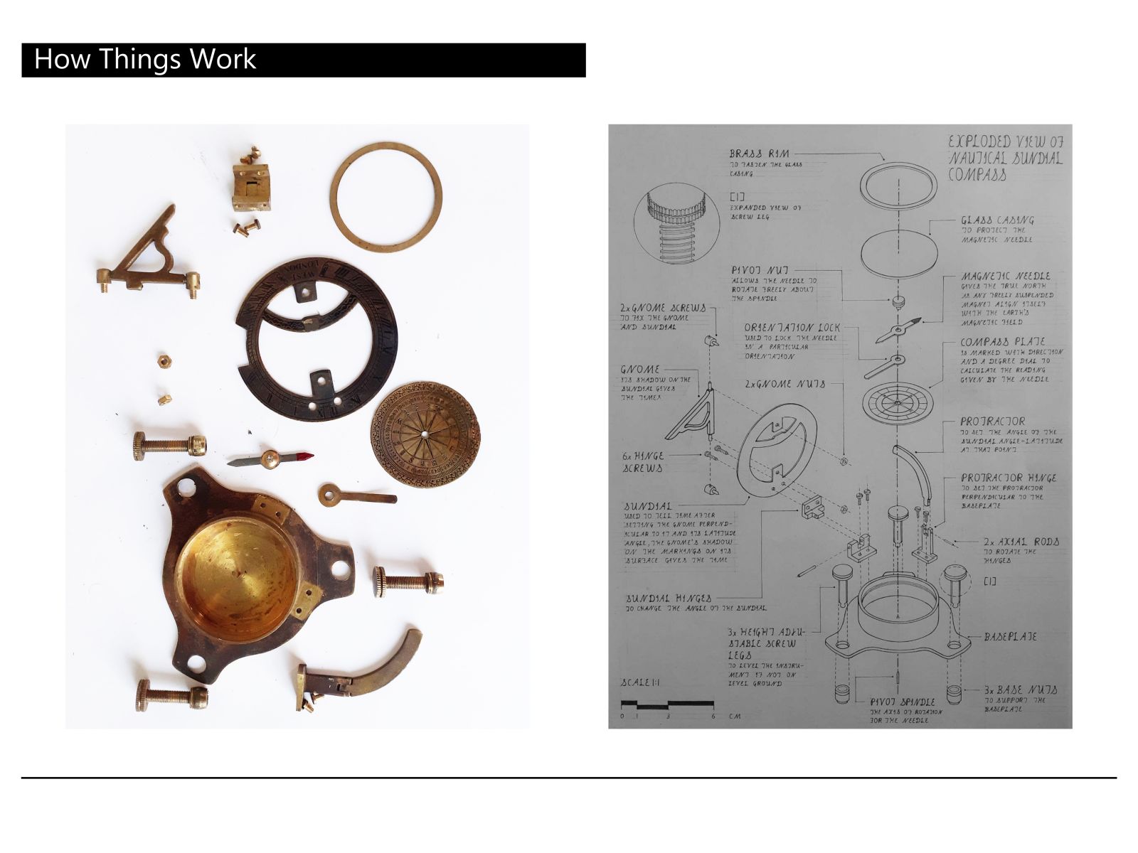
While initially taking baby steps in the first two months, we finally began our expedition towards the deeper ends of the pool with this exercise, which involved drawing its exploded view of any object, i.e. each part as it would be industrially produced and how they would align together. I now began to comprehend how perfectly designed each part was, even the downright trivial such as the Gnome. Most of the parts had circular cross-sections, aligning about a central axis. One major part of this exercise was the increased focus on composition, to the minutest of strand of text; instead of just spending the last 10 minutes on dimensioning and writing, considering it as ancillary work. With the navigation of the tutors, the text and its font were organised in particular lines and in a particular style. This emphasis on composition made it much neater and easier to comprehend.

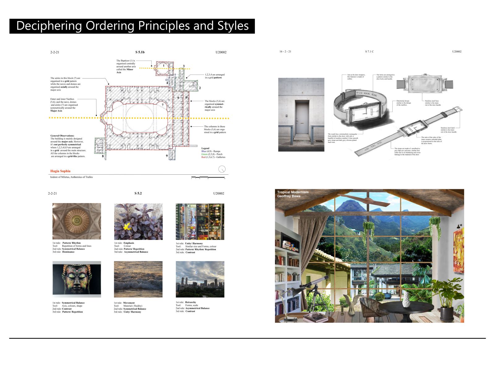
This slide contains images pertaining to two exercises- the two on the left to deciphering rules of composition and the two of the right to deciphering styles. The first exercise was a sudden change of pace as it didn’t involve drawing, but rather physically going out and exploring our surroundings. Initially, I thought clicking the pictures for the bottom left sheet would be quick, but that proved to be deceptive as the rule of composition depicted by each photograph had to be glaringly obvious. On the suggestion of the tutors, I ensured all pictures were of a different environment and scale. Clicking these photographs transformed the way I looked at my surroundings, focusing on identifying such nuances like its balance rather than its superficial beauty. A simple picture of alcohol bottles seen in the sheet looked as a depiction of unity, rather than as beer bottles. This was the first time I looked through a designer’s eye. The last image was where I got to test my photoshop skil

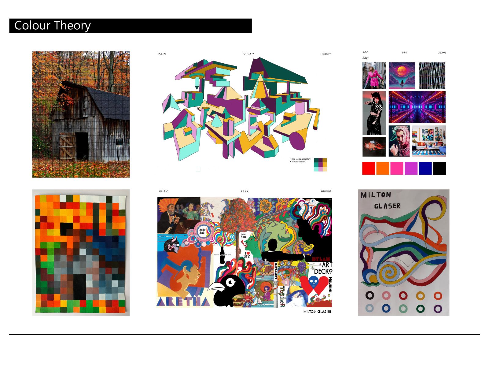
This slide contains my work on colour theory, and its study with regards to Milton Glaser. However, this caption will focus on something learnt while frantically clicking pixelated sheet 10 minutes before the deadline- the effect of the phone’s colour-correction. To put it very simply, colour-correction is how cameras show the colour of the same object. The same object can look dull or reflective. The sheet was photographed repeatedly because some things captured seemed wrong. The dark-blue roof, the blue-grey body of the house seemed light blue while the physical pixelated painting seemed much truer to it’s prussian colour. This was due to the camera’s colour-correction. Affected by the room’s lighting and the sheet’s high colour contrast, the phone’s colour-correction brightened the house up. This also brightened the brown roof in the centre, reducing the contrast with the overlapping orange leaves, ironically changing them into a dull gradient in the photograph. LUT thus sto

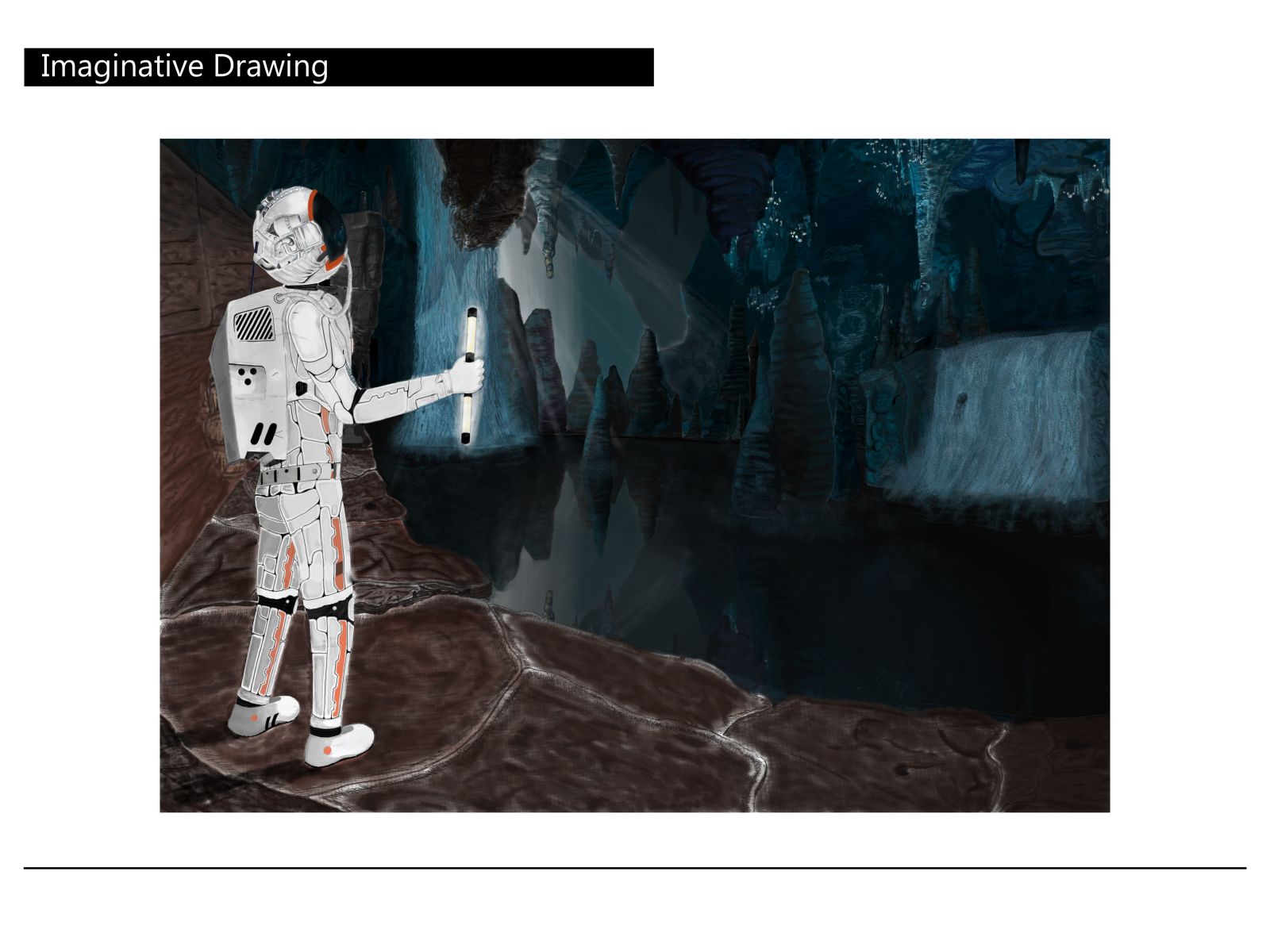
Amazed by the level of realism of video games and concept art, this was my first foray into creative illustrations. Software was used to achieve this sheet, adding several layers of detail over sketches by a grey pencil. Every light ray, reflection (even in the helmet) could be drawn, with object-blur in real time, instead of using Photoshop’s blur-tool post-facto. But this accounting of every light source, their position, direction, posed a new challenge. Initial drafts were hence filled with arrows tracking all possible light sources. This hesitation before placing any drop of colour to verify whether it conformed to the flow of light provided a weird sense of excitement. Adjacent stalactites therefore could have completely different colour values, as seen in the region of emergence of the sun-like rays. A new appreciation of light has been embedded in my mind, vastly different from sketches with it’s singular light source.

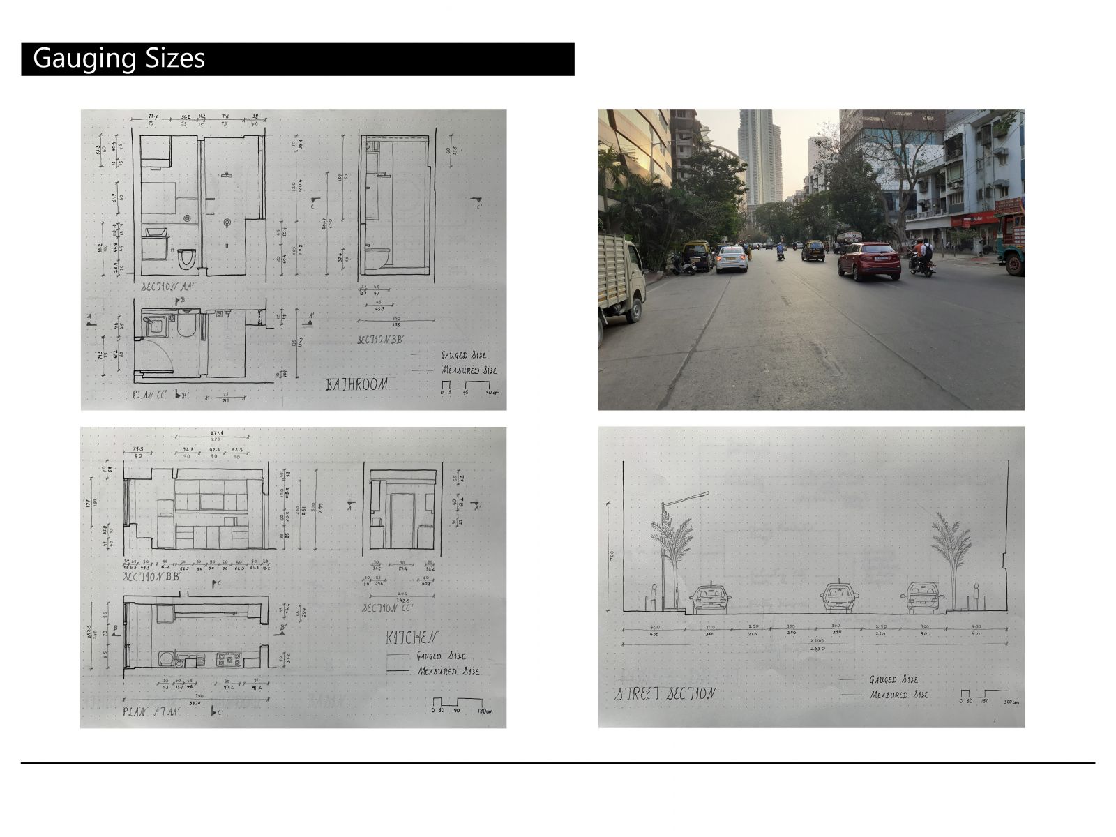
This exercise involved us estimating the measurement of the spaces around us and drawing it. My bathroom, kitchen and a neighbouring road has been gauged and uploaded above. It was my first time drawing a room with its marked sections, plans in their nomenclature. This compelled me to study every corner, even the columns and slabs surrounding the room, first using my body parts then by a measuring tape. I began noticing several previously missed details, such as the extension of the right column seen in the plan below the window. But the true test was not gauging the sizes of sinks, but rather unintentionally memory retention while jotting down dozens of dimensions during the frequent trips to the bathroom (for measurements obviously!)