Adithya Sainath

CFP001

U21005

The Monsoon semester focuses on equipping students with various techniques to visualise, draw and represent. The students also start to engage with existing buildings to identify various building elements, basic construction materials and methods. They practise and work intensively to perfect their freehand drawing and perspective drawing, to visualize and draw complex compositions. They also learn to make technical drawings using orthographic projections, surface development and the exploded view of a complex object. A series of exercises in sketching will enable the students to sketch freely in order to observe, document, imagine and improvise.The exercise on gauging sizes will develop the habit of estimating sizes using one’s body and through it the students will begin to engage with the concept of anthropometrics. Through the exercise on building elements and materials the students will start to engage with existing buildings to decipher their building elements and materials and understand the sequence of construction. In the last exercise the students will go through the process of documenting an existing building and making a set of architectural drawings.

View Additional Work
Report Content

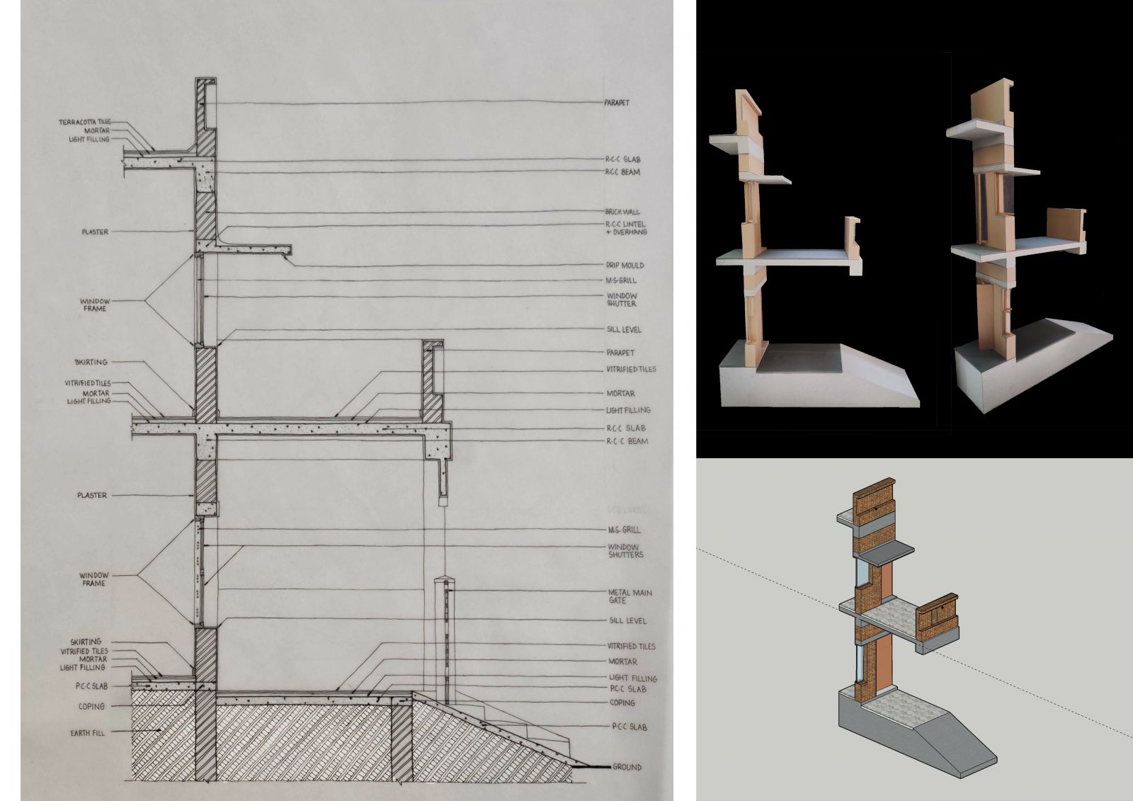
Wall Section of residence selected for the study of building elements and materials with corresponding model.

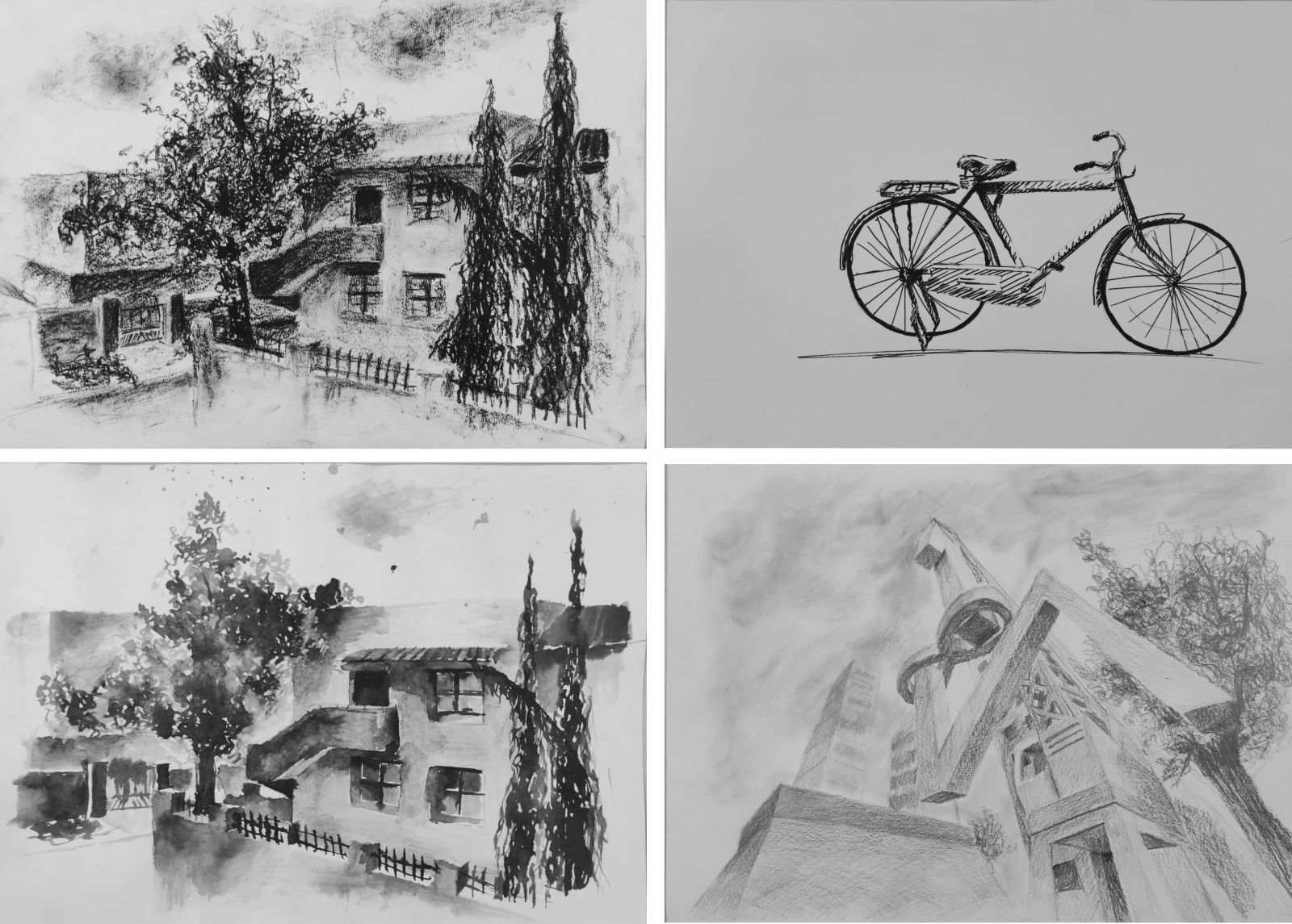
Sketches on the left show the same view with with charcoal (top left ) and ink and kitta (bottom left). Sketch on the top right is of a parked bicycle attempted in sign pen and the sketch on the bottom right is an imaginative drawing that depicts the mounting of giant letters to signify a monument in the city when the viewer is standing below it.

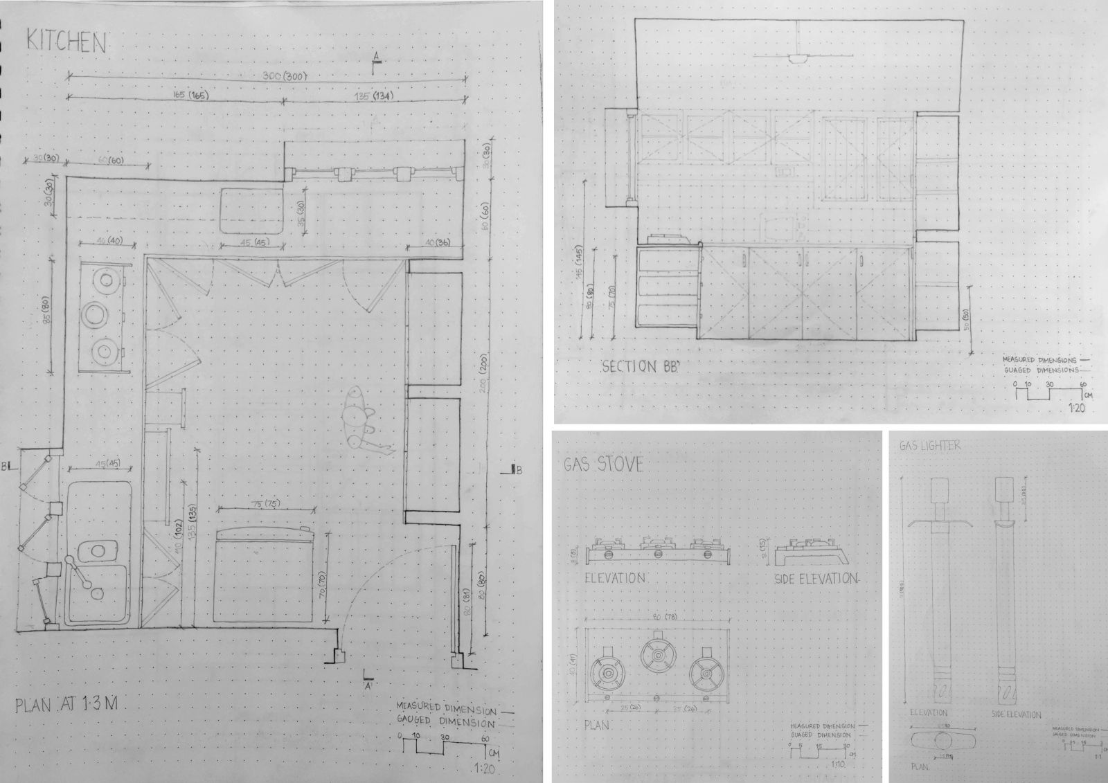
The plan, and one of the sections (section BB'), an appliance and an object of the kitchen have been drawn freehand on a gridbook by guaging their dimensions with reference to my body.

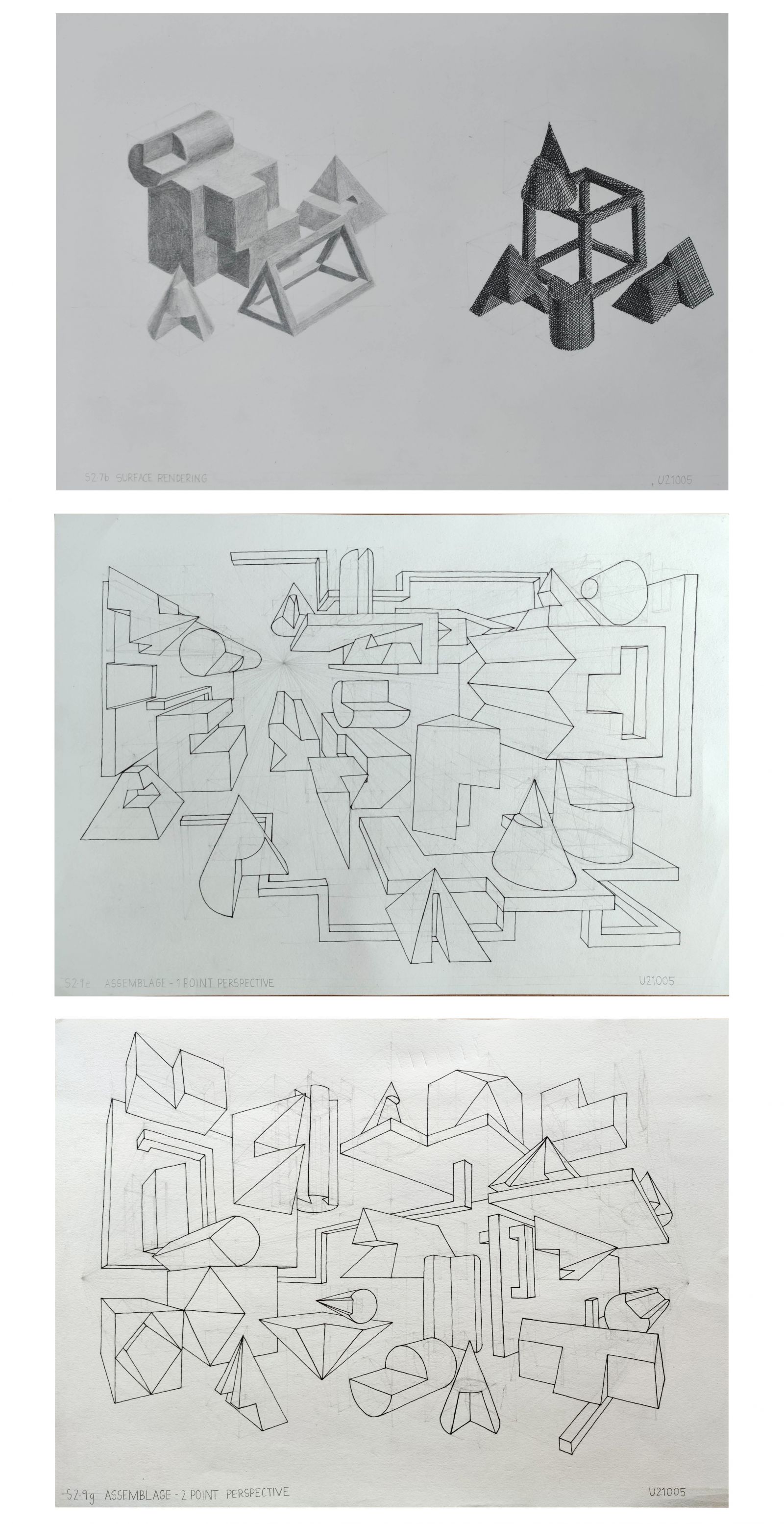
Pencil and pen rendered freehand compositions , and freehand perspective assemblages

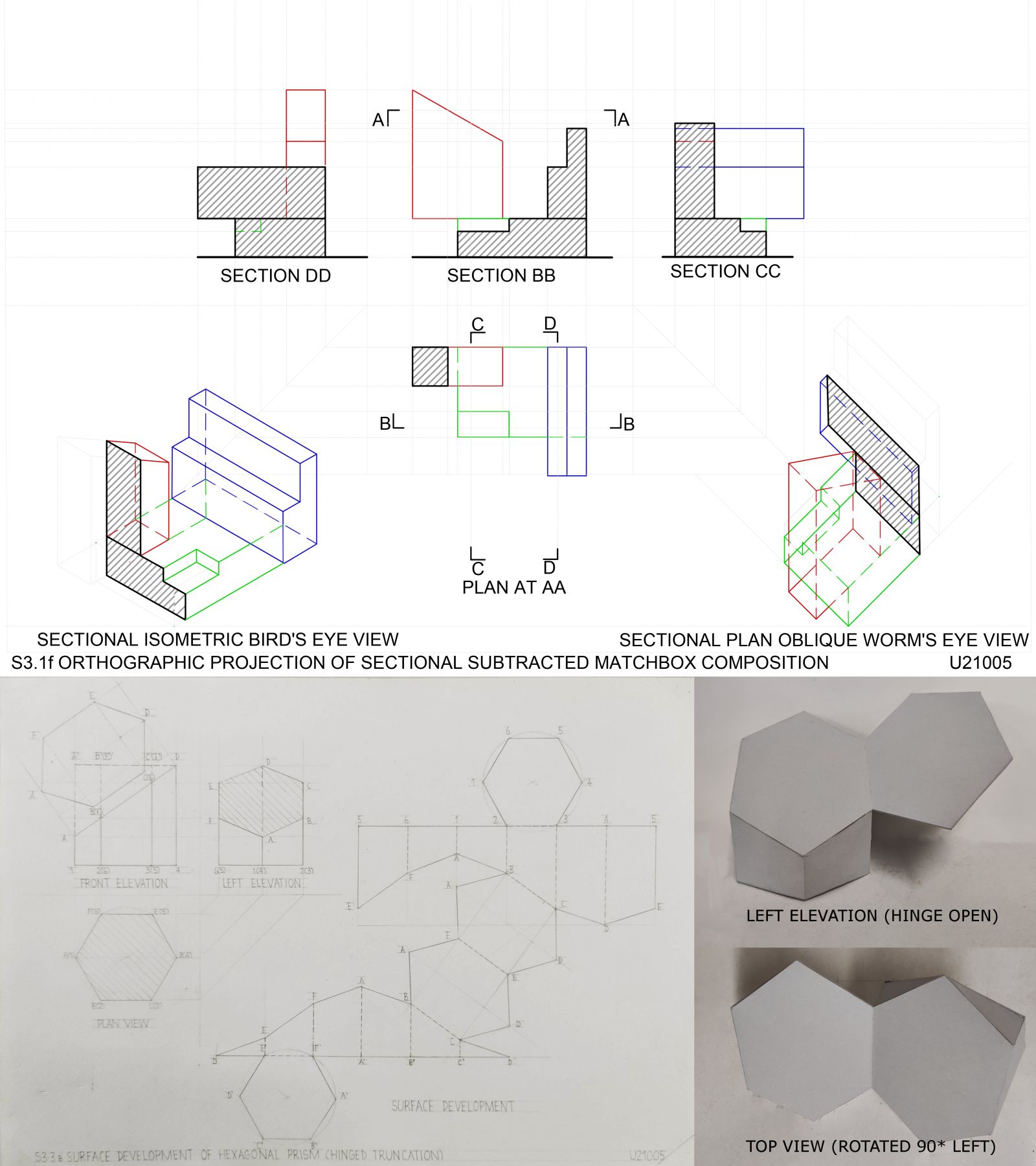
Orthographic, isometric and axonometric drawing of sectioned matchbox composition(AUTOCAD). Following it is the orthographic views and surface development of a hinged truncated hexagonal prism and its corresponding model.

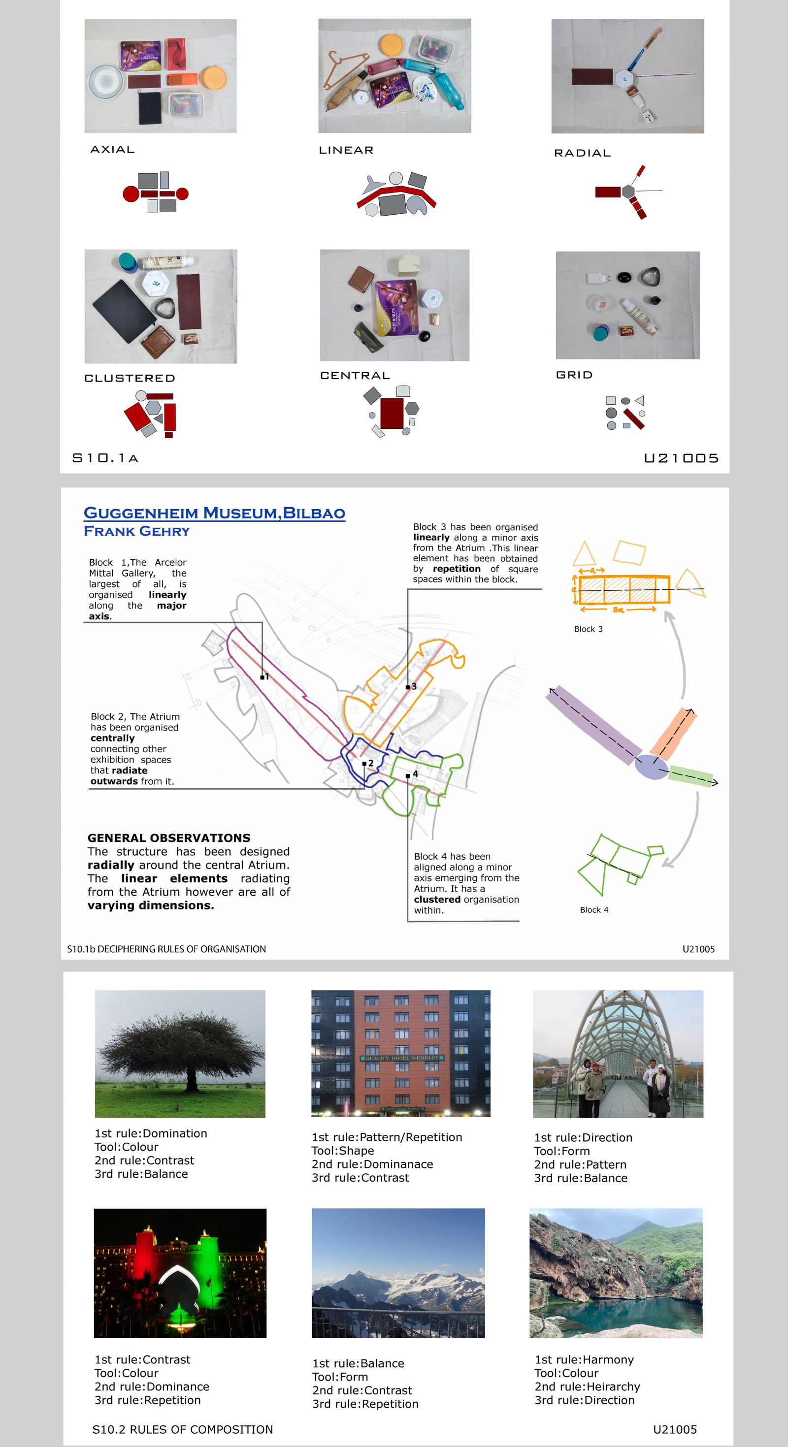
Household objects were first arranged to first understand the various rules of organization. With this understanding these rules were identified from the plan of an architectural project. The rules of composition were then understood with the help of images along with the visual tools that helped achieve them.

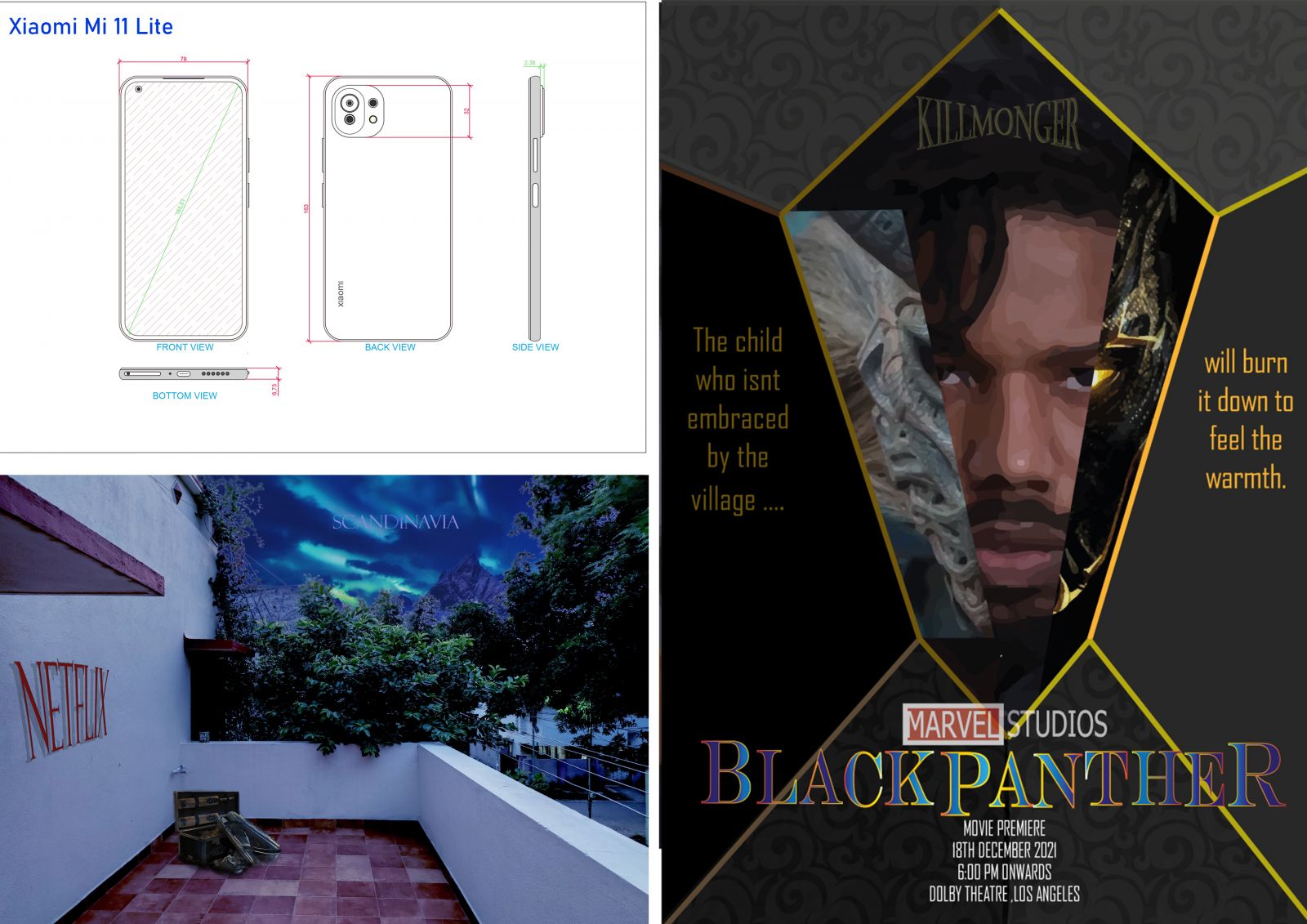
An AUTOCAD drawing of my phone has been made on the top left of the slide. Bottom left of the slide shows a photoshopped image of my balcony with the activities that kept me occupied during the lockdown and a place I wanted to visit being the background. The right hand side of the slide is a movie poster designed on Illustrator.

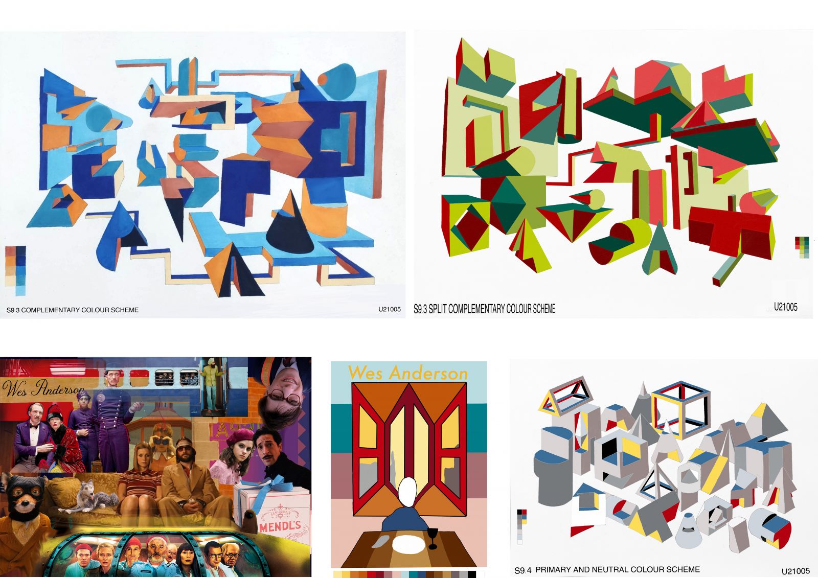
One-point and two-point perspective assemblages have been colored using the direct complementary and split complementary colour schemes respectively. The isometric assemblage (bottom right) uses the primary and neutral colour scheme. At the bottom left is a collage representing the use of colours by Wes Anderson in his films. The colour palette he used has been depicted in the graphic at the bottom center.

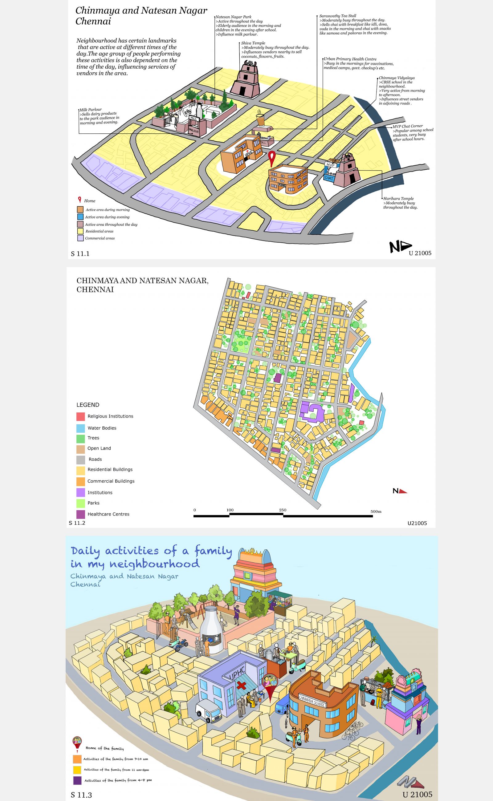
The first map from the top is a mind of of my neighbourhood where major landmarks and the activities at these landmarks have been highlighted. The center map is a base map of my neighbourhood traced on AUTOCAD from a Google Earth image representing the various kinds of spaces in my neighbourhood. The illustration at the bottom depicts a day in the life of a family residing in the neighbourhood and how they use the different landmarks at different times of the day.

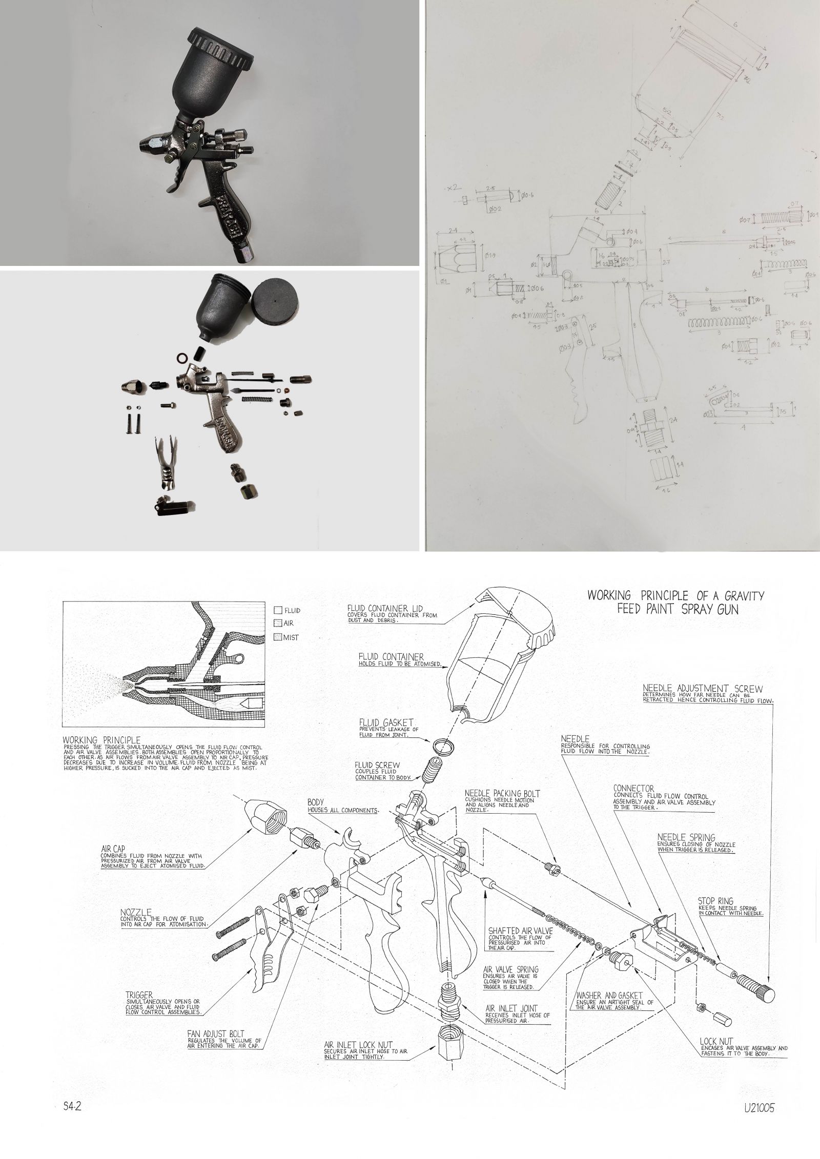
The object was disassembled and a freehand 2D drawing was made to understand the major dimensions of individual components. Below it the exploded view of the object provides information as to how the components are assembled along with their names and functions. A brief note on the working principle of the object has also been provided.