Keertana Jayraj Bhatt

CFP001

U23102

TThe CEPT Foundation Programme studio is an introduction for students fresh out of school to the rigor and work habits required by an undergraduate degree at CEPT University. The studio is conceptualized as a series of sequentially planned exercises, through which students develop skills and abilities, which are then deployed to address increasingly complex problems falling in four broad categories: visualize and draw, make and learn, anayse and interpret and conceptualise and represent. The exercises are designed to provide foundational skills for students across disciplines at CEPT, between which they maintain a balance. They also reflect an understanding that at the foundation level, these skills overlap to a large extent, and a varied array is of benefit to all students. The studio is taught through intensive 1–2 week long modules, focusing on a particular skill or ability, and a process that emphasizes ongoing feedback in addition to expert faculty lectures.
Report Content

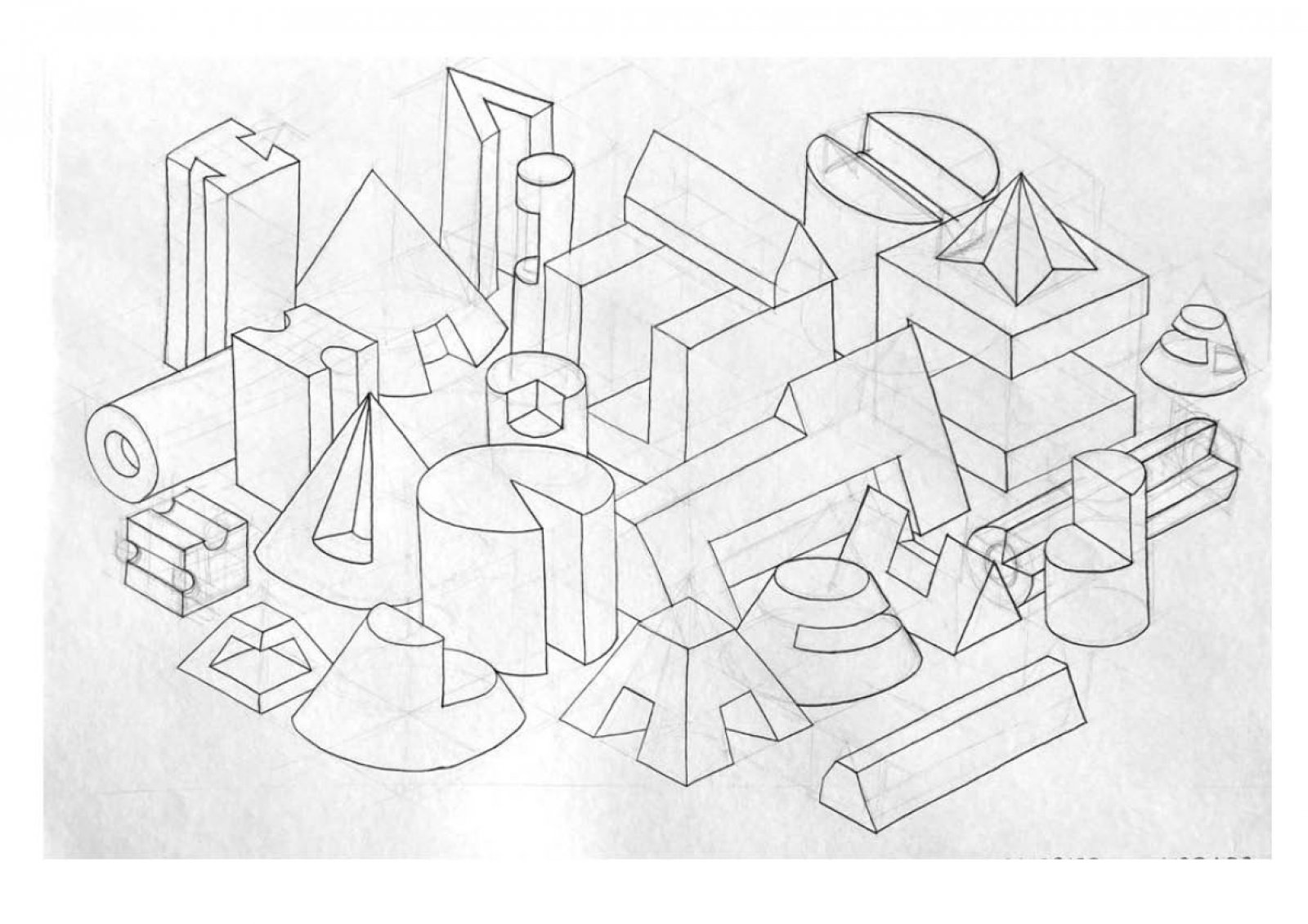
Assemblage of 25 subtracted solids, constructed manually without the use of any geometric tools.

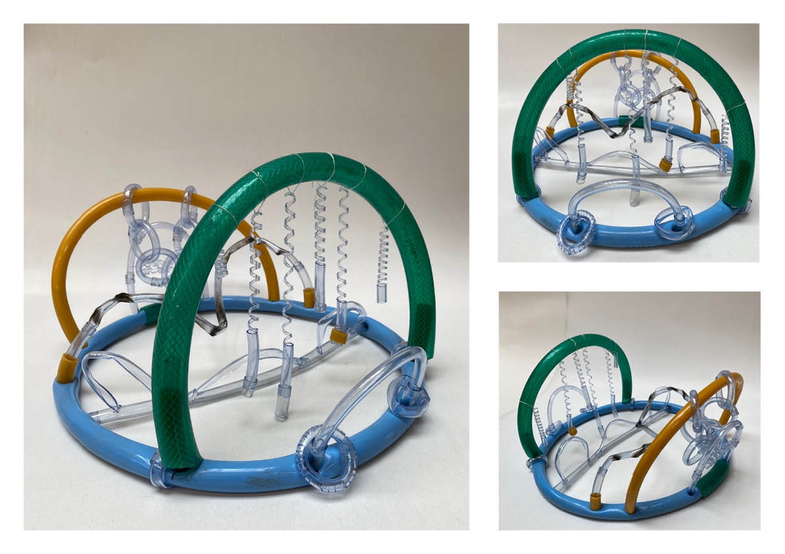
The model depicts the manipulations performed on the flexible Polyvinyl Chloride tubes to project its different properties such as flexibility and elasticity. Each of these properties are highlighted through different manipulations on each arch.

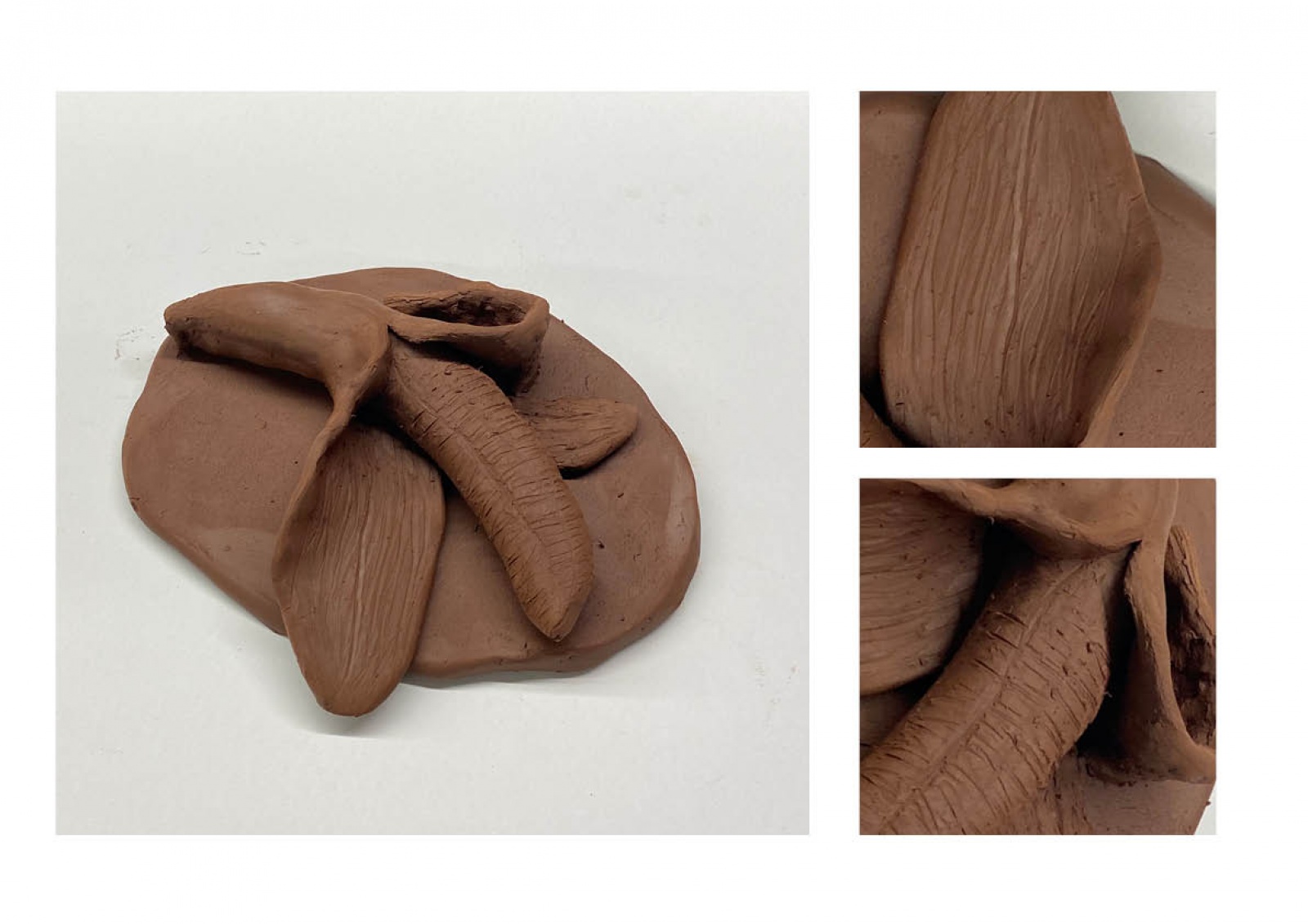
Exploring the medium of clay through an attempt at creating a live scale clay model of a peeled banana on an abstract oval pedestal.

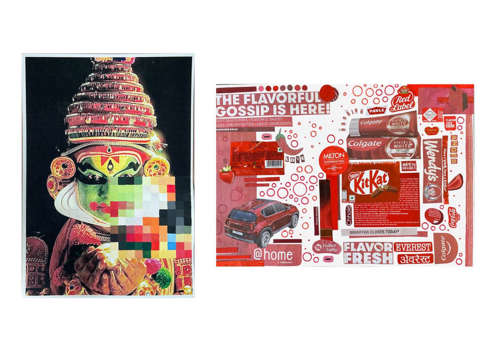
Left, Manually pixilating 10x10 cm grid over the image of Kathak Kali, with each pixel meticulously painted and color matched by mixing colors on the palette, serves as a comprehensive exercise in understanding color composition. This method allows for a detailed examination of the original image's colors, as each pixel's hue is individually adjusted to harmonize with the overall composition. By engaging in this hands-on approach, one gains a nuanced understanding of color blending and composition, as well as a deeper appreciation for the intricacies of the artistic process. On the right side, a monochromatic montage is created using red materials collected from various sources such as packets, newspapers, and magazines. These materials are arranged in a visually cohesive manner, forming a unified composition that explores the expressive potential of the color red.

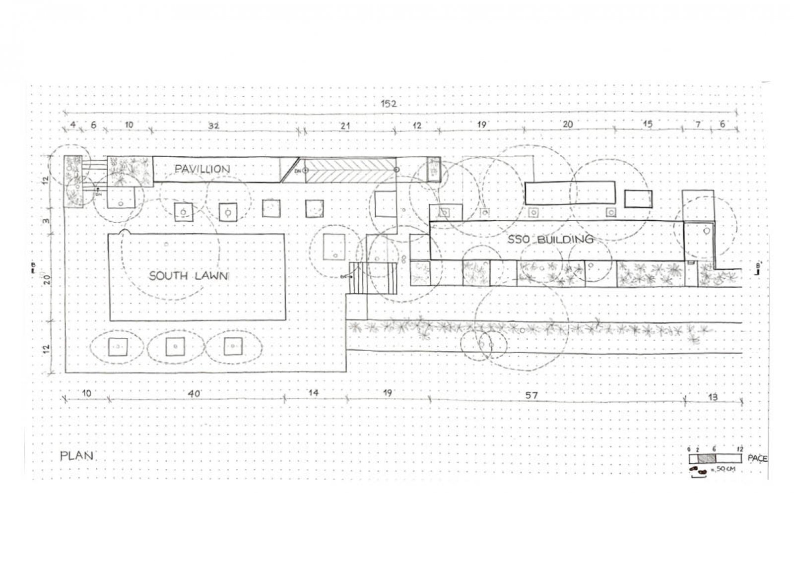
Plan of the Student Service Office (SSO) and South Lawn made with gauged measurements on a dot grid A3 size paper.

Left, Exploded Isometric View of the Manual Rotatory Blender, highlighting the use of each of the parts along with its working mechanism. On the right side, the labelled exploded isometric view provides the information regarding the material of each of the parts.

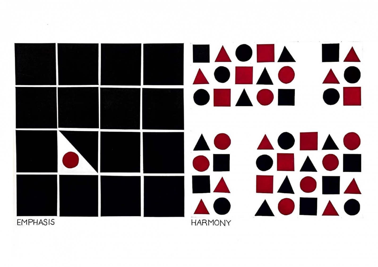
The sheet shows an attempt at representing the principles of visual composition using just three shapes and only two colours.

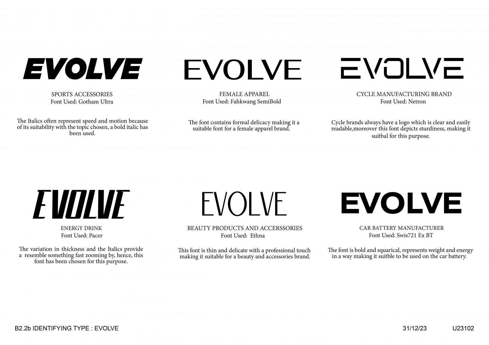
The impact of typeface on the perception of a versatile word across different industries is explored. By applying various typefaces to the same word, its suitability for specific industries is assessed, aiming to understand how typeface selection can influence the perceived alignment of a word with different industries, highlighting the importance of typography in branding and communication.

Depicting the meaning of the word through manipulating the letters of the word to create an engaging visual concept.

Having lost the Father of Indian Architecture, India suffered a great loss on 24th January 2023. Heavily inspired from his mentor Le Corbusier and Louis Kahn, B.V. Doshi made his name with his modernist style with a reflection of Indian traditions and morals in his designs. Holding tightly onto his roots and traditional values he gravitated towards creating spaces which were sustainable and focused on conserving energy. His designs were brutal and honest with bare facades exposing the material used in making the building. This raw touch made his designs uniquely beautiful like concrete and exposed bricks with none of his buildings missing his famous skylights in order to allow natural light to filter. This poster is an attempt to capture the essence of his designs through an abstract created using the common geometric elements seen consistently in his designs like rectangular windows, semi circular vaults and corridors like forms. The use of geometry is evident in his designs which I