Your browser is out-of-date!
For a richer surfing experience on our website, please update your browser. Update my browser now!
For a richer surfing experience on our website, please update your browser. Update my browser now!
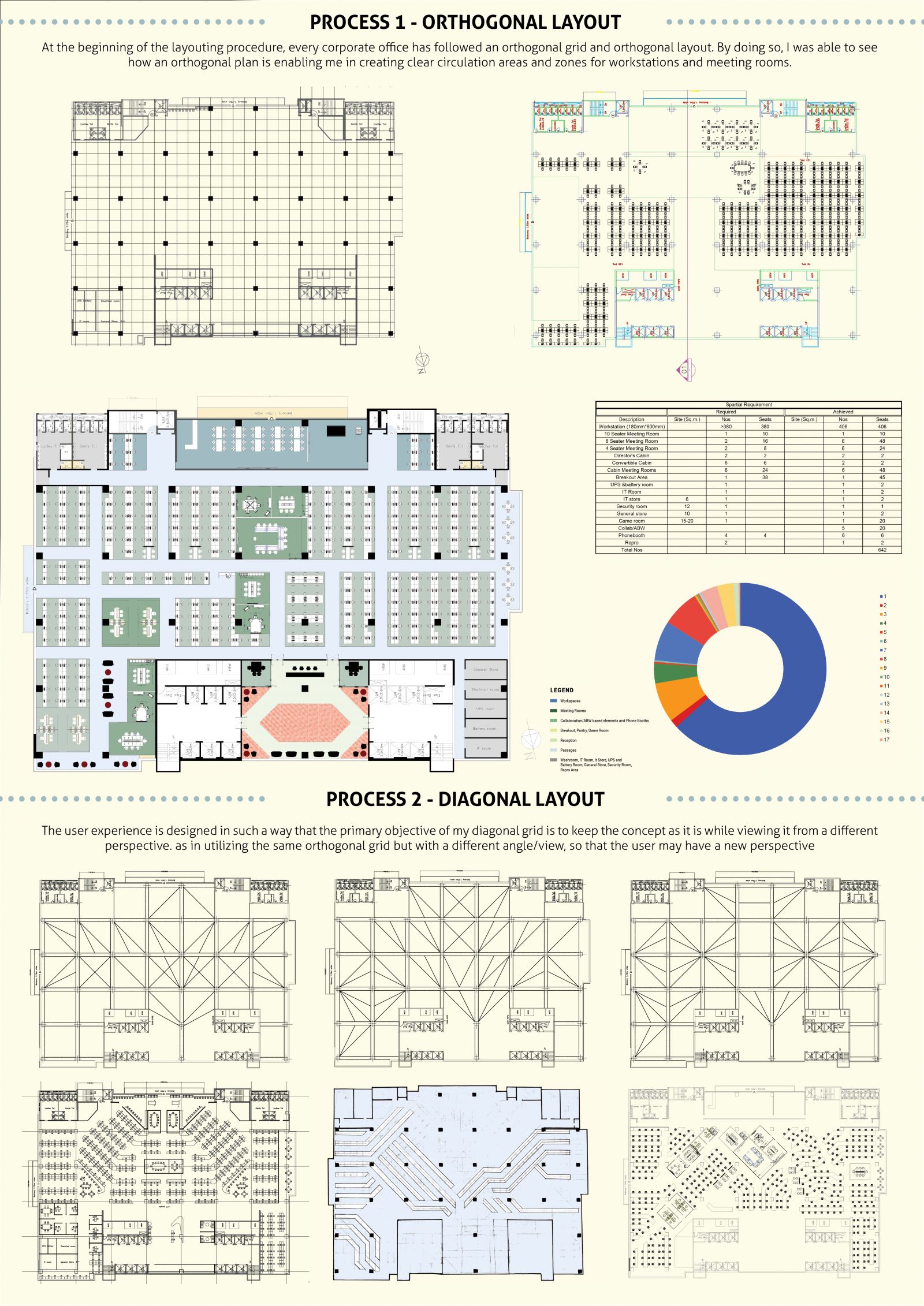
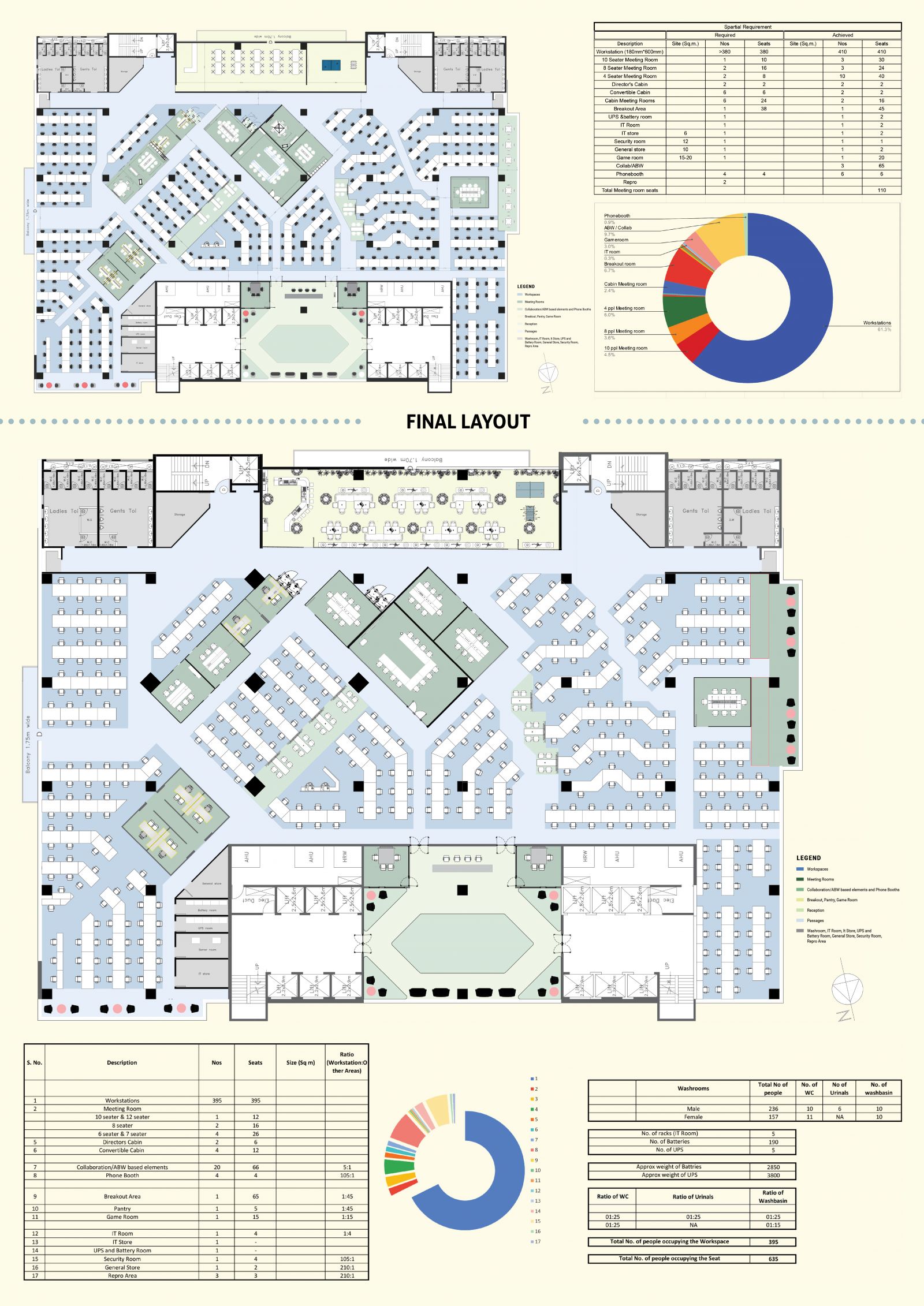
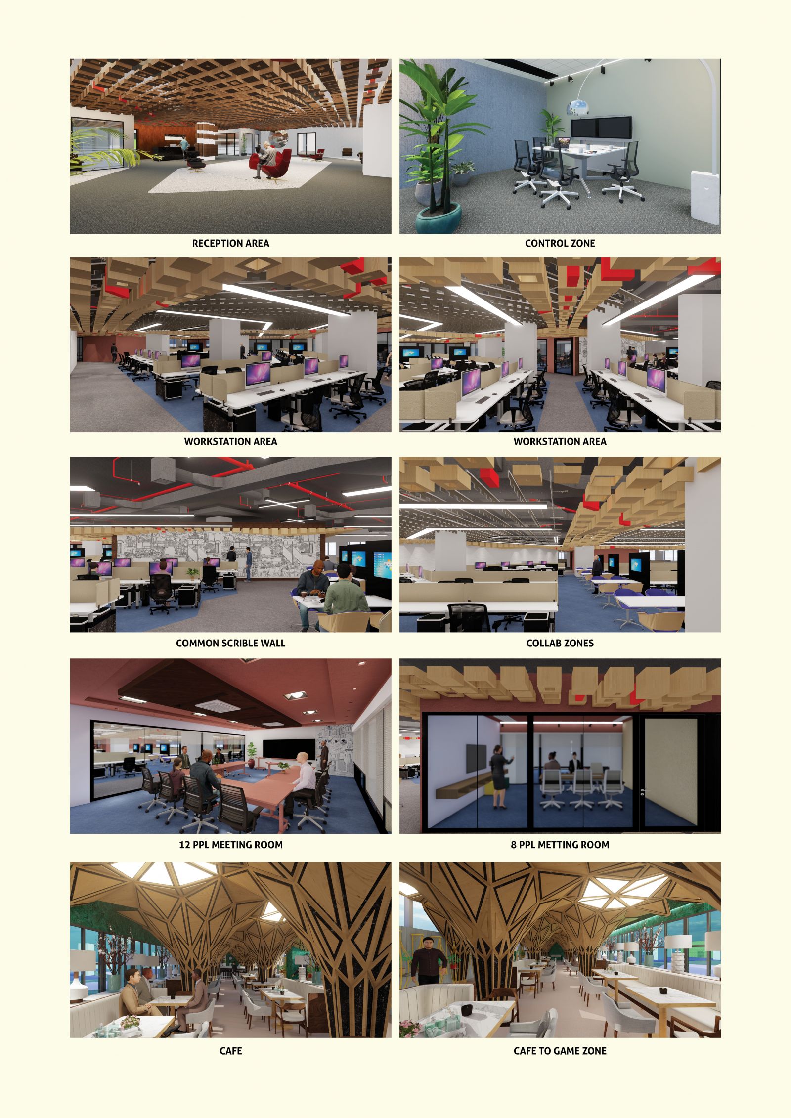
At the beginning of the layout procedure, every corporate office has followed an orthogonal grid and orthogonal layout. By doing so, I saw how an orthogonal plan enables me to create clear circulation areas and zones for workstations and meeting rooms. The user experience is designed so that the primary objective of my diagonal grid is to keep the concept as it is while viewing it from a different perspective. As in utilizing the same orthogonal grid but with a different angle/view, the user may have a new perspective.
View Additional Work