Your browser is out-of-date!
For a richer surfing experience on our website, please update your browser. Update my browser now!
For a richer surfing experience on our website, please update your browser. Update my browser now!
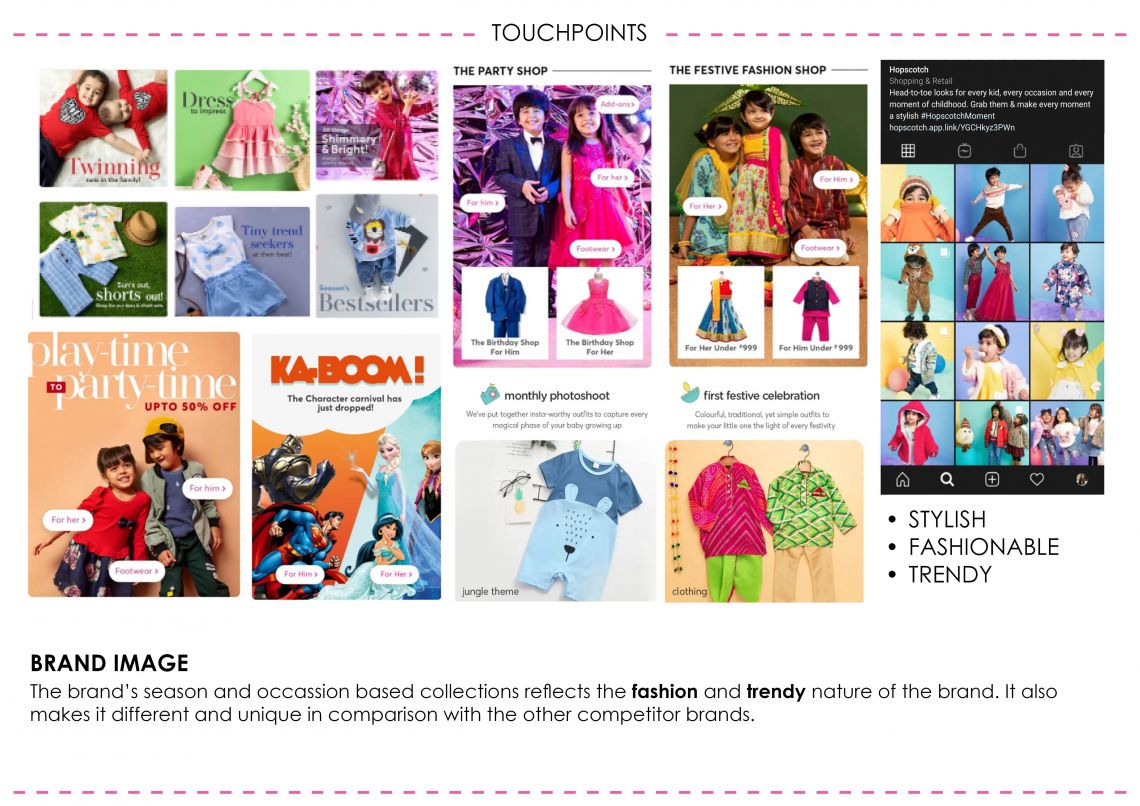
It is currently an online brand selling multi-label kids apparels and accessories. It caters to 2 months to 12 years of kids age group. Since the products are sold online, its website is the most important brand touch point for customers. It also has a significant social media presence. The brand image which I get after looking to its website and Instagram page is its Stylish, Fashionable, Trendy and Affordable. The brand currently is active in kid’s apparel.
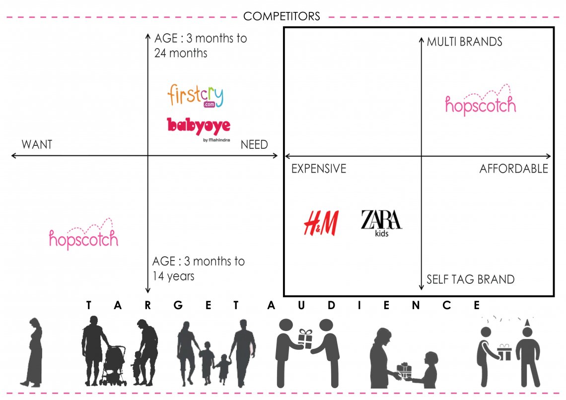
In comparison to their competitors, what I got to know is although all the competitor brands cater to basic requirements of the kids but the approach taken by each is different. Firstcry and babyoye portrays their product as need whereas hopscotch portrays itself as a fashion forward brand that every mother wants. Also comparing hopscotch with H&M kids and Zara kids is it’s a self-label brand and expensive. So if mother wants her child to be stylish and wants to create a look for her child she will come to hopscotch as it is affordable too. Hence the design goal is to create the environment to showcase the brand as stylish and fashionable yet affordable brand for kids.
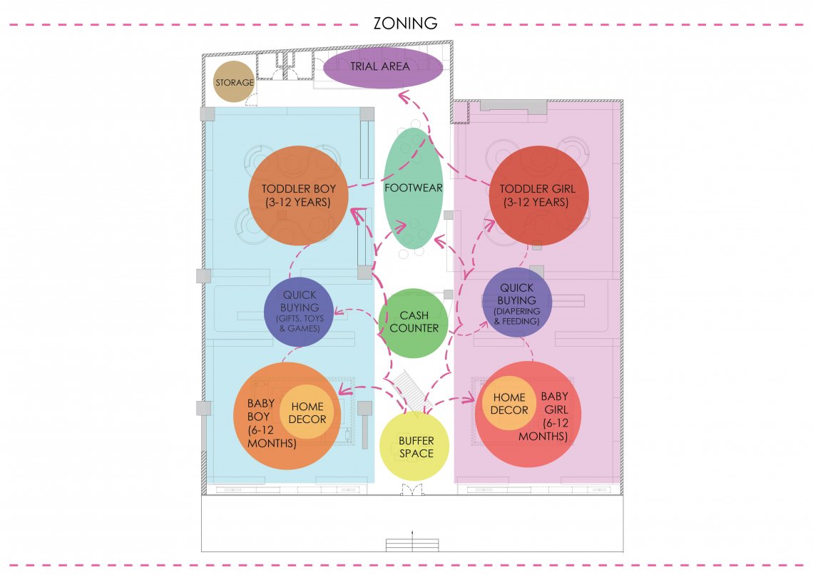
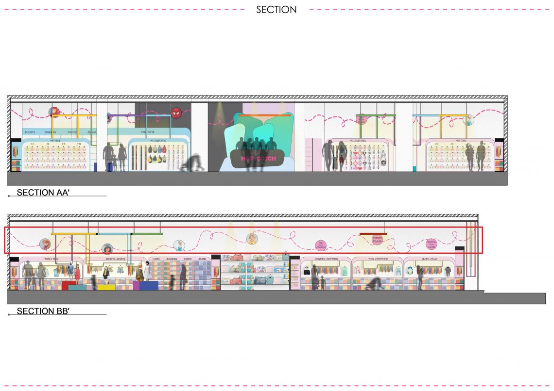
: In this the major zoning is divided in boys and girls.
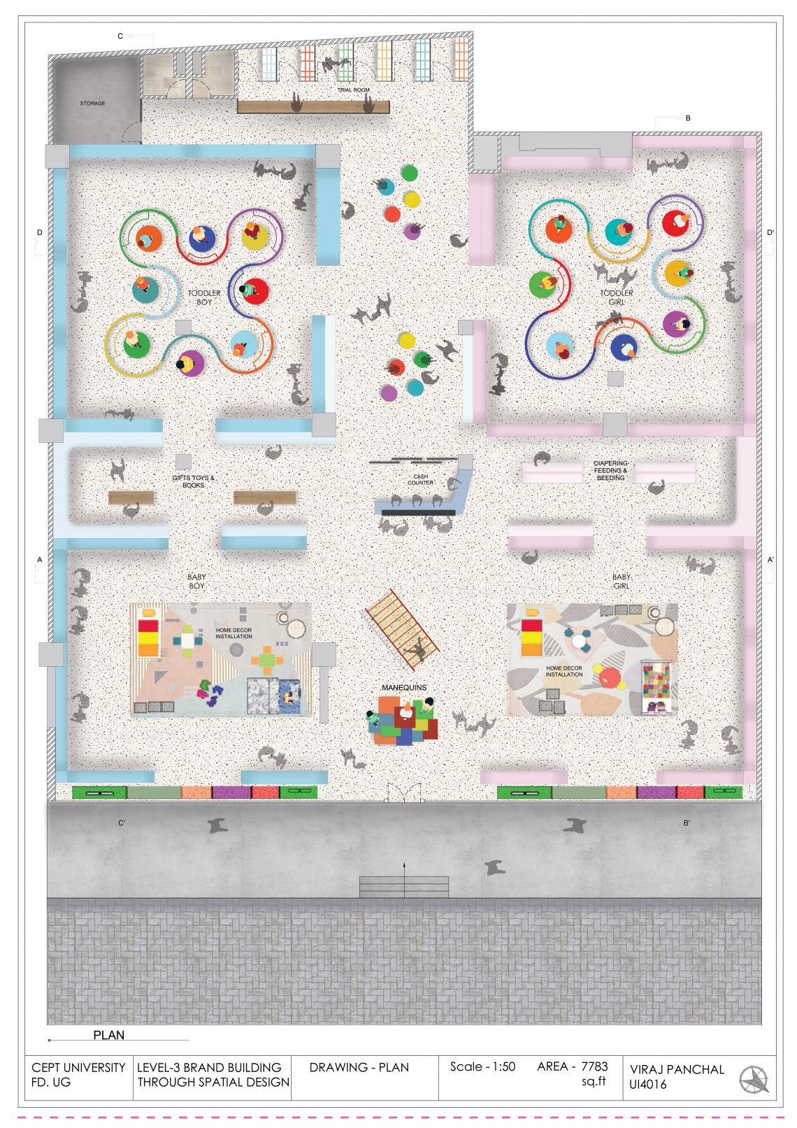
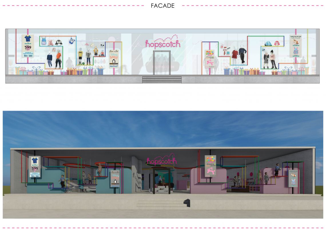
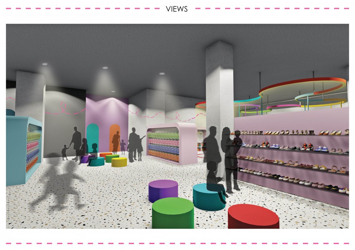
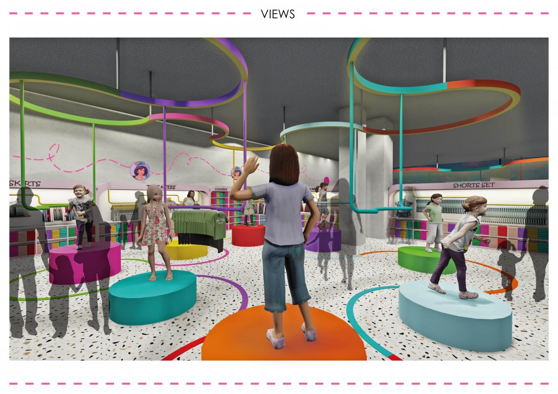
This further is divided age wise. Buying kid’s clothes usually have the cuteness factor. If you see some cute little thing you will tend to buy it or it will get your attraction keeping this process in mind zoning is done. I have kept home decor installation in starting so it is seen by every customer when they enter. As this brands talks about different looks there are this circular platforms in the center of the toddlers section which will have different looks mannequin on it and are rotating. And in the periphery there are different sections for apparel. As it’s a kids store I want to give some playfulness and cuteness in the space so there is this amoebic shaped flooring pattern which shows the movement pattern around the mannequins which also helps to bound the whole space. As I want transparency in space I didn’t give any kind of partition in store. So keeping this in mind facade is also design in such a way that one can see what is happening in the store and so the products will attract more customers. Also their is LED screens in which it shows different brands which hopscotch has, informing viewers that it’s a multi label brand and their day to day sales. So when the store is close one can have an idea about the brand. The vertical members are colorful acrylic pipes and the horizontal members are colorful acrylic sheets. The mannequins are kept with its accessories which is creating the whole look.
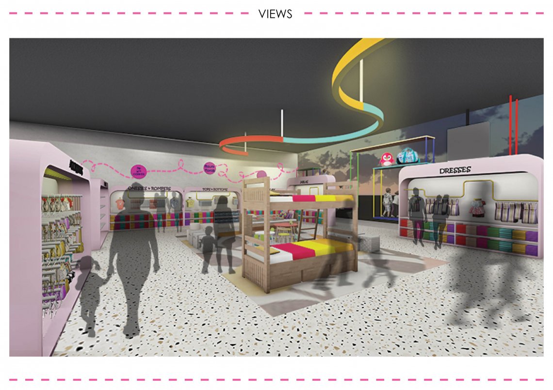
Also there is this graphics which I have created on wall inspired from its logo and in the circle some of them will have their new collection appearance and some of them will have cute slogans on different styles. Also there is this light element which is is suspended from ceiling to add playfulness in the space and makes the space one.
In order to define space instead of partitions the floor area has been demarcated using carpet. Firstly this helps maintain transparency in store and secondly the usage of carpet welcomes the customer to use the product display by creating a homely and friendly zone.
In toddlers section the similar flooring shape is suspended from ceiling which is a light element from it the rods are suspended on which sale clothes will be hang. And hence this element is also use for merchandise and adds playfulness in the space. The material of this element is metal which has color painted on it. To view portfolio click here.