Prochetah Ghosh

ID4021

Cuboidal Manifestations for GOOGLE Office

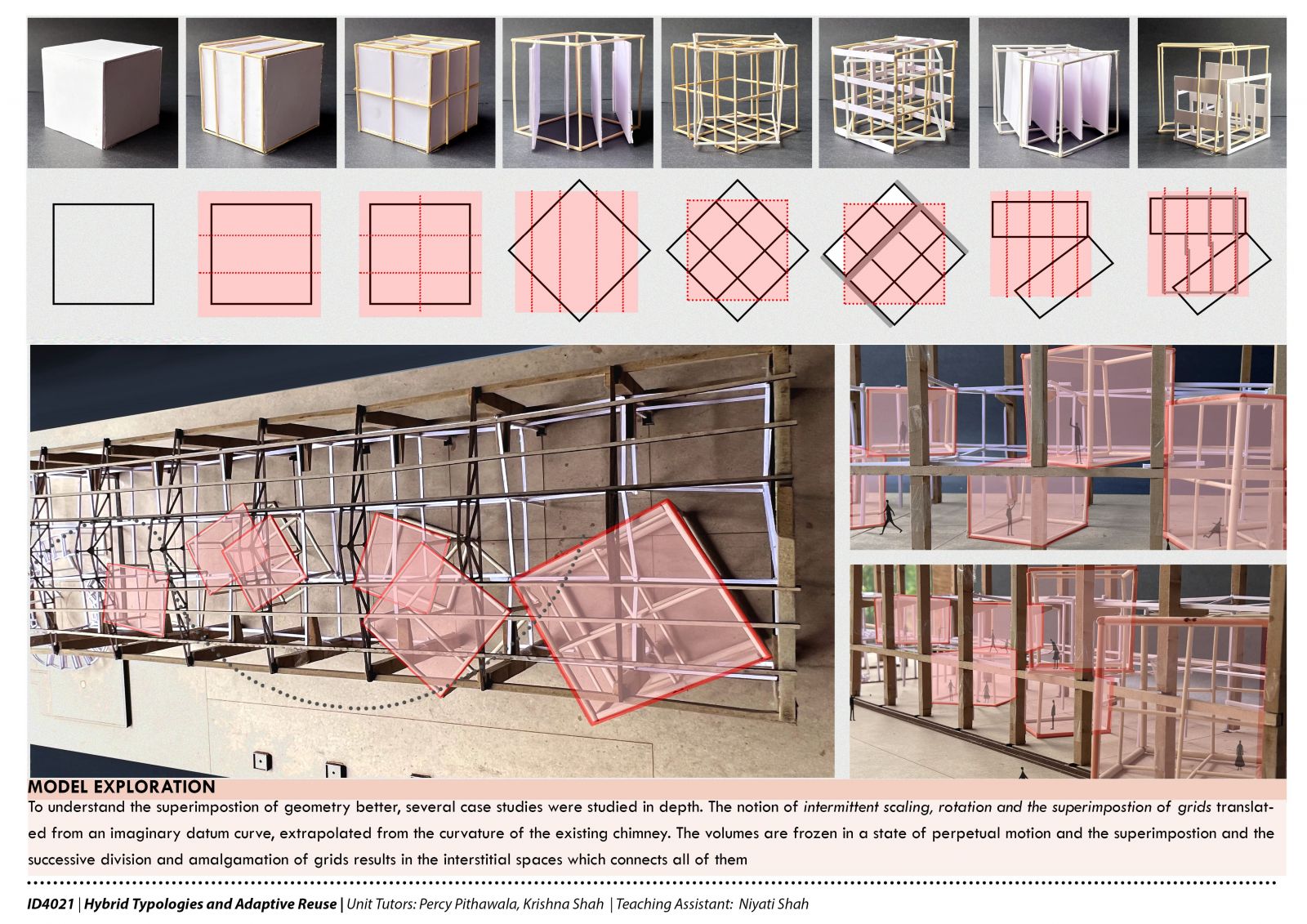
The core idea behind this project was to extrapolate the design techniques of the artist, Peter Eisenman, and apply them to the Alembic Site for Google Office. It is a journey of volumes that are held gravitationally by the site chimney. The interiors that follow arise from the superimposition of these volumes. The superimposition also follows through by following Eisenman's principle of superimposing the grid on grids. These volumes transverse across the shell laterally and transition through various levels of transparency. The spaces that arise provide a playful meld of work and play and develop new aesthetics for the site
Report Content

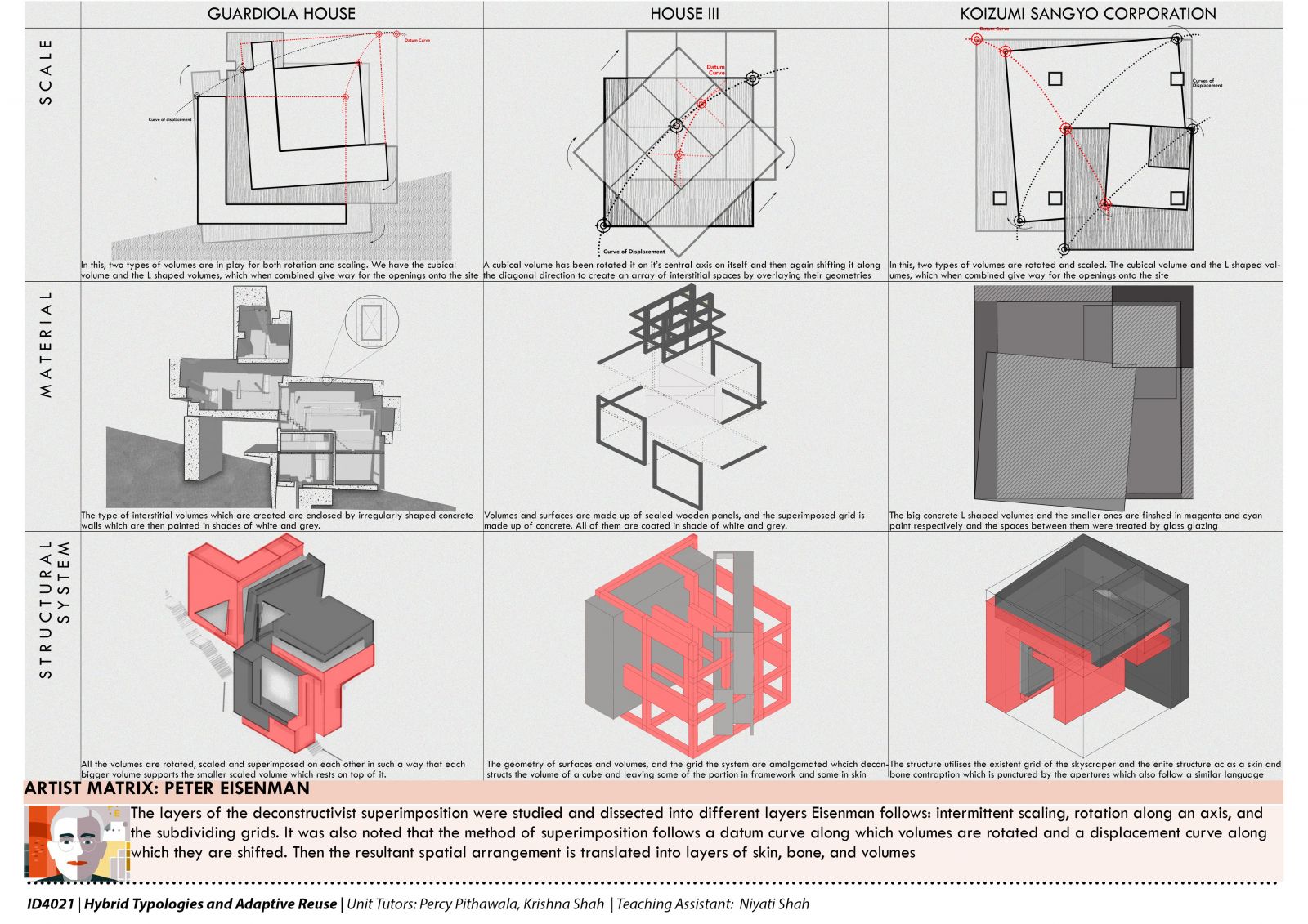
Artist Matrix: Peter Eisenman - To understand his works, various examples were studied and dissected to understand the principles of superimposition, scaling, shifting, and rotation and also his use of skin, bone, and volumes

The essence of Eisenman's techniques was taken and applied on the Alembic Site. The idea was the shifting of cuboidal volumes which transverse laterally and longitudinally across the longer edge of the shell

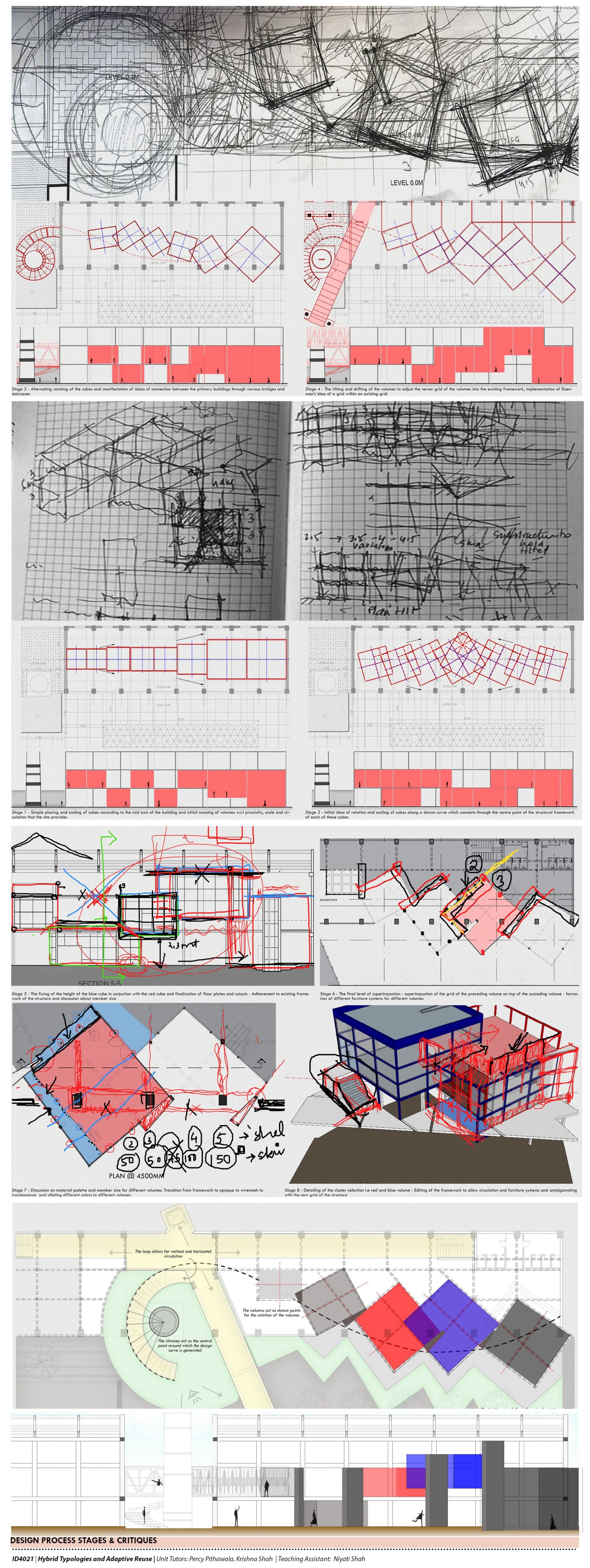
The Process & Deliberations - The next layer that followed was the idea of a datum curve, which originated from the curvature of the site chimney and tethers the volume along it. These volumes keep on increasing in scale, as one transition through them. The curve also provided various tether points around which the volumes were rotated

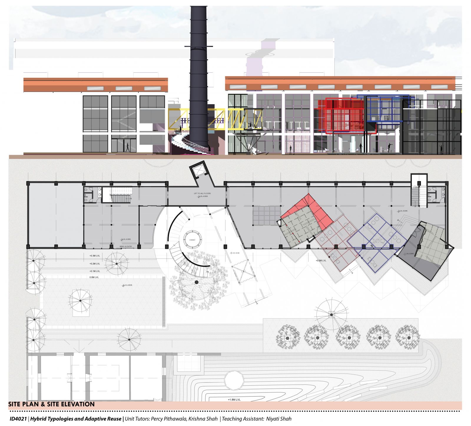
Site Plan & Elevation: The idea was to open up the building to the Alembic Plaza by connecting through a circulation core on the first floor, which incises the building opening up to the plaza, opposite it. The shell is tightly wrapped by a curtain wall, which also frames the volumes which peek out the shell.

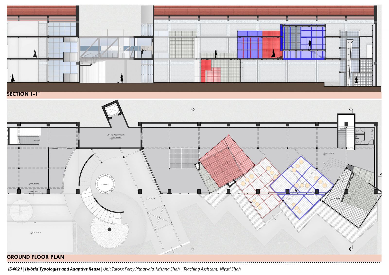
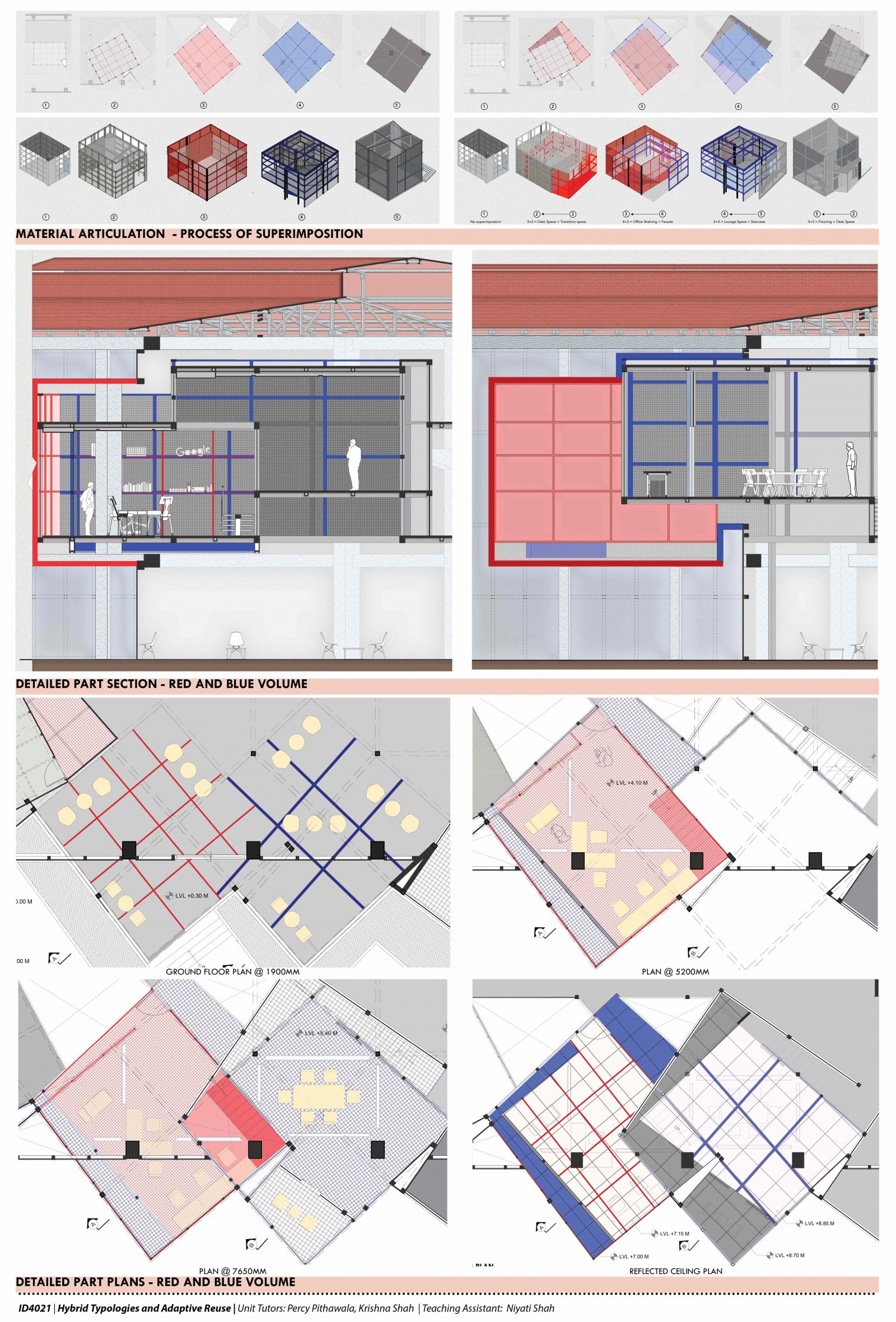
Ground Floor Plan & Section 1-1' - The next layer of superimposition that followed was the superimposition of the grid of a volume on the volume preceding it. This created a series of interior systems for the volumes around which various spaces and furniture were derived

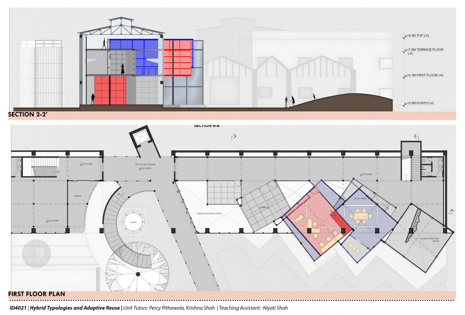
First Floor Plan & Section - This shows the connection of the building to the site and how the volumes also visually overlap as one goes through the shell.

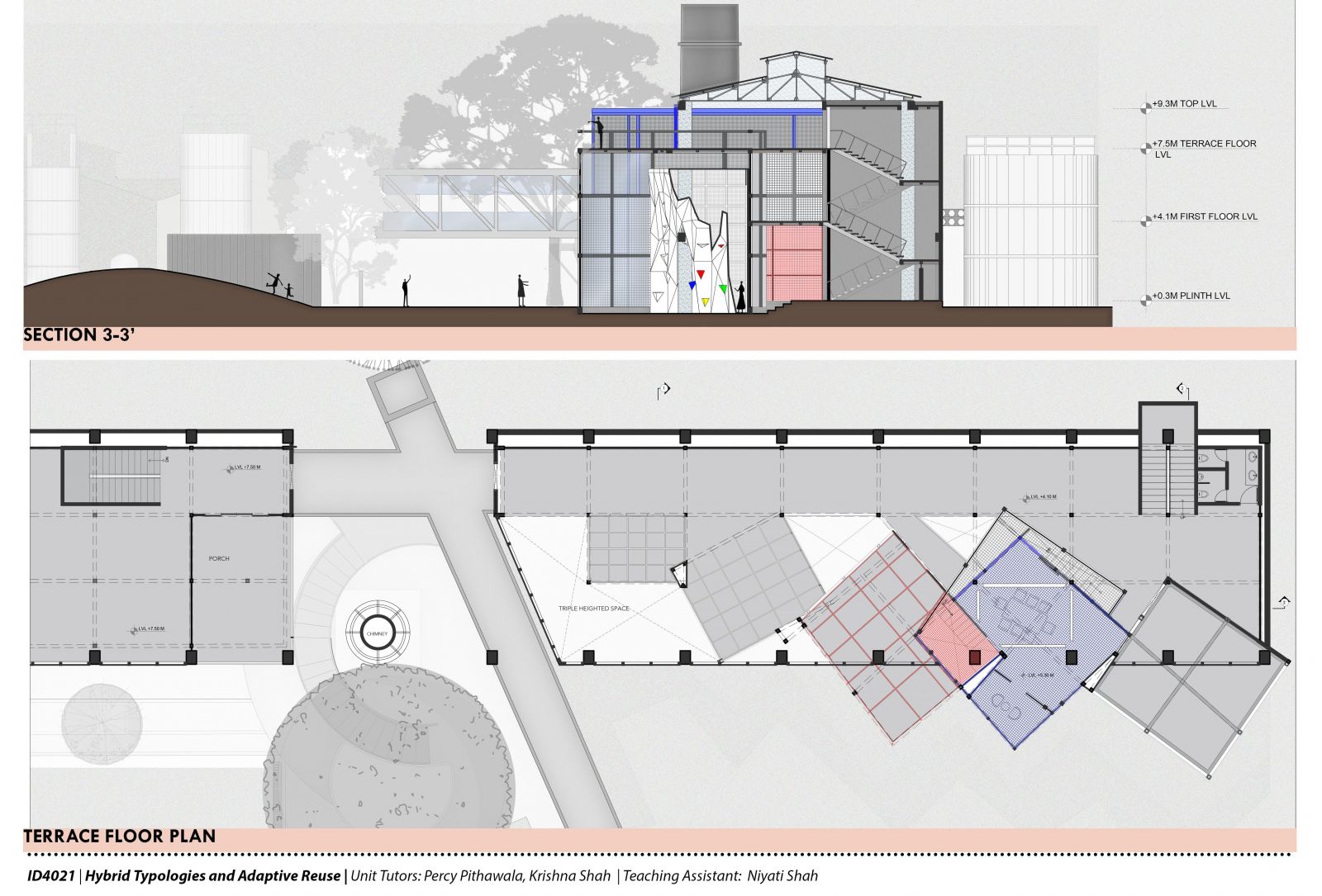
Terrace Floor Plan & Section 3-3' - The series of volumes and with the largest one at the end of the shell. This volume hosts team-building activities and idea pitching, which also incorporates the idea of work and play through activities like rock climbing

The Red Cube & Blue Cube - Detailed Exploration: This panel explains the process of superimposition in detail with the respect to these volumes. It also specifies the material palette for various volumes which determines the level of transparency in transition across the entire arrangement.

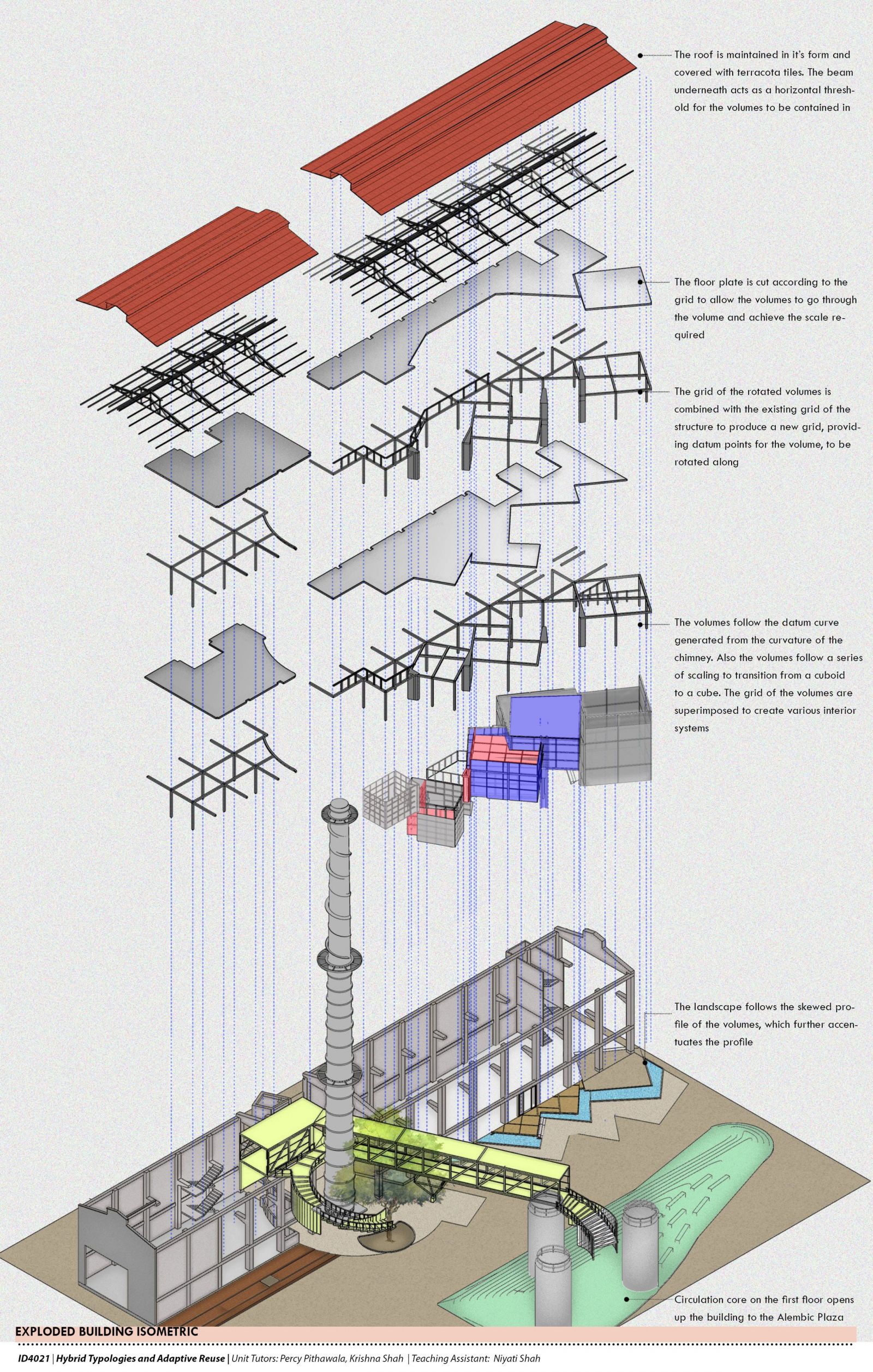
Exploded Building Isometric - This drawing explains the intervention and the existing structure in tandem and determines the threshold along which it follows. It also shows the central circulation of the building to the plaza and how the structural grid works with the volumes

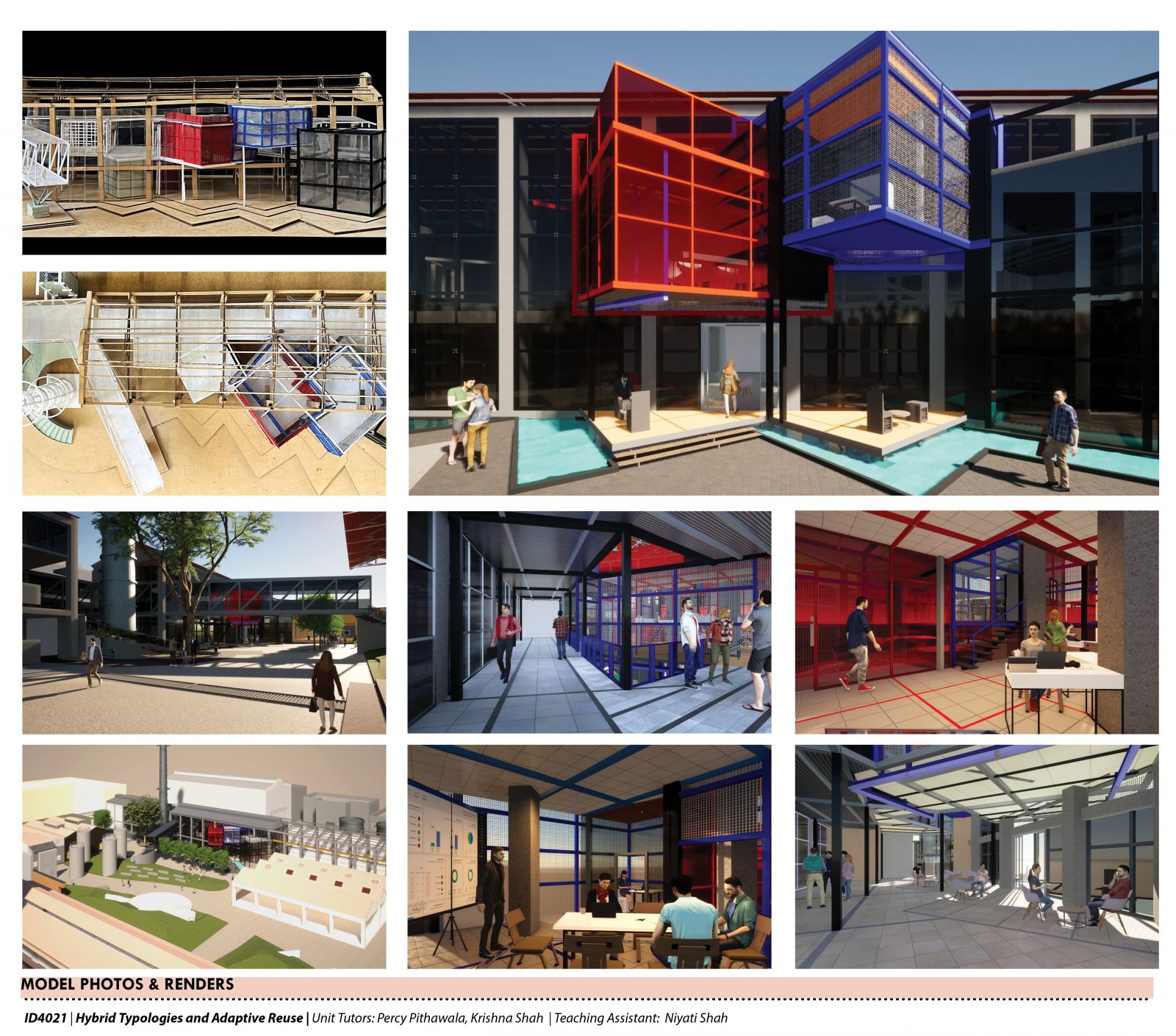
Model Images & 3D Renders - Images showing the exterior and interior of the building in real-time. It also imbibes the aesthetics of Eisenman, in following the geometry of the grid and also provides a sense of order and play in the space