Trisha Karthik

AR2042

Nature Orientation Centre

The project intends to explore the sanctity of knowledge. With the main program of the centre being a library, the design becomes a temple for learning. There is a recognition of various forms of knowledge exchange, namely, oral transmission, visual as well as transfer through corporeal engagement (such as cooking). Thus the spaces include a kitchen/cafe, an amphitheatre, a studio/gallery and a library. 
The central arrangement of spaces suggests this sanctity, with the centre harbouring the library, where the core acts as the display/ storage of the books. The circular forms demonstrate the destruction of hierarchy in the process of knowledge transmission. This idea is then propagated through the singular roof that defines the enclosure of the entire project, suggesting the idea that ‘everyone sees the same sky’.

View Additional Work

Report Content

The focus of the study was the materiality of the ground and its relation to the sky through degrees of enclosure. The subsequent layer of light quality was explored through a lense of temporality. Four instances were studied: -Light on Shaded Unpaved Path -Light on Unshaded Paved Path -Light on Reflective Surface -Light Within Courtyard in the morning, afternoon and in the evening.

ADJACENCY DEVELOPMENT: These diagrammatic models study the relationships between different functional spaces based on privacy, enclosure and sound. From these observations, adjacencies were derived.

BUILT EXPRESSION: The diagrams represent the development of the overall form and structure as well as the modular form and structure, including iterations of openings to achieve the optimum light quality inside each space.

PLAN AT +1.2M: This plan explores the treatment of the ground, the usage of mounds as plinths and the activities that occur in the voids.

PLAN AT +3.2M & PART PLAN: These plans shows the activities that occur in the masses. and how the spaces are used and separated based on degrees of privacy. The furniture is movable and the wedge shape allows customization.

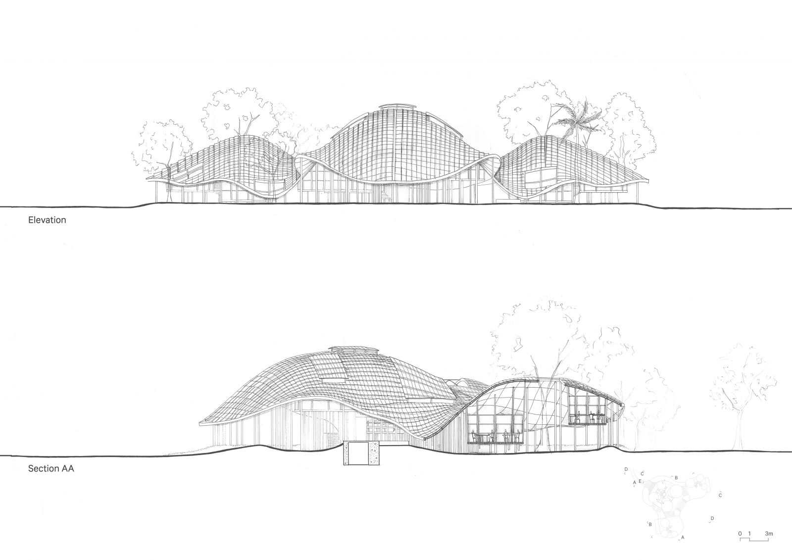
ELEVATION: This is the front elevation of the project, it depicts the first view that the user would have of the built form. SECTION AA: This is a short section of the Kitchen and the Cafeteria spaces.

SECTION BB: This section of the library depicts the ground and roof (sky) modulation and how they formally reflect each other, tying back to the site study of the lake. SECTION CC: This is a short section of the Studio and Gallery Spaces.

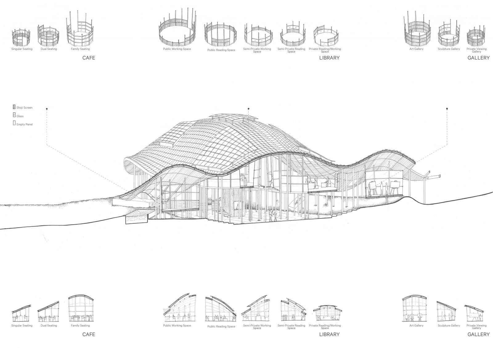
SECTIONAL AXONOMETRIC: The drawing attempts to show a longitudinal cross section of the project to show the activities the occur, the different kind of spaces, the type of enclosure that each module has as well as the connection between spaces.

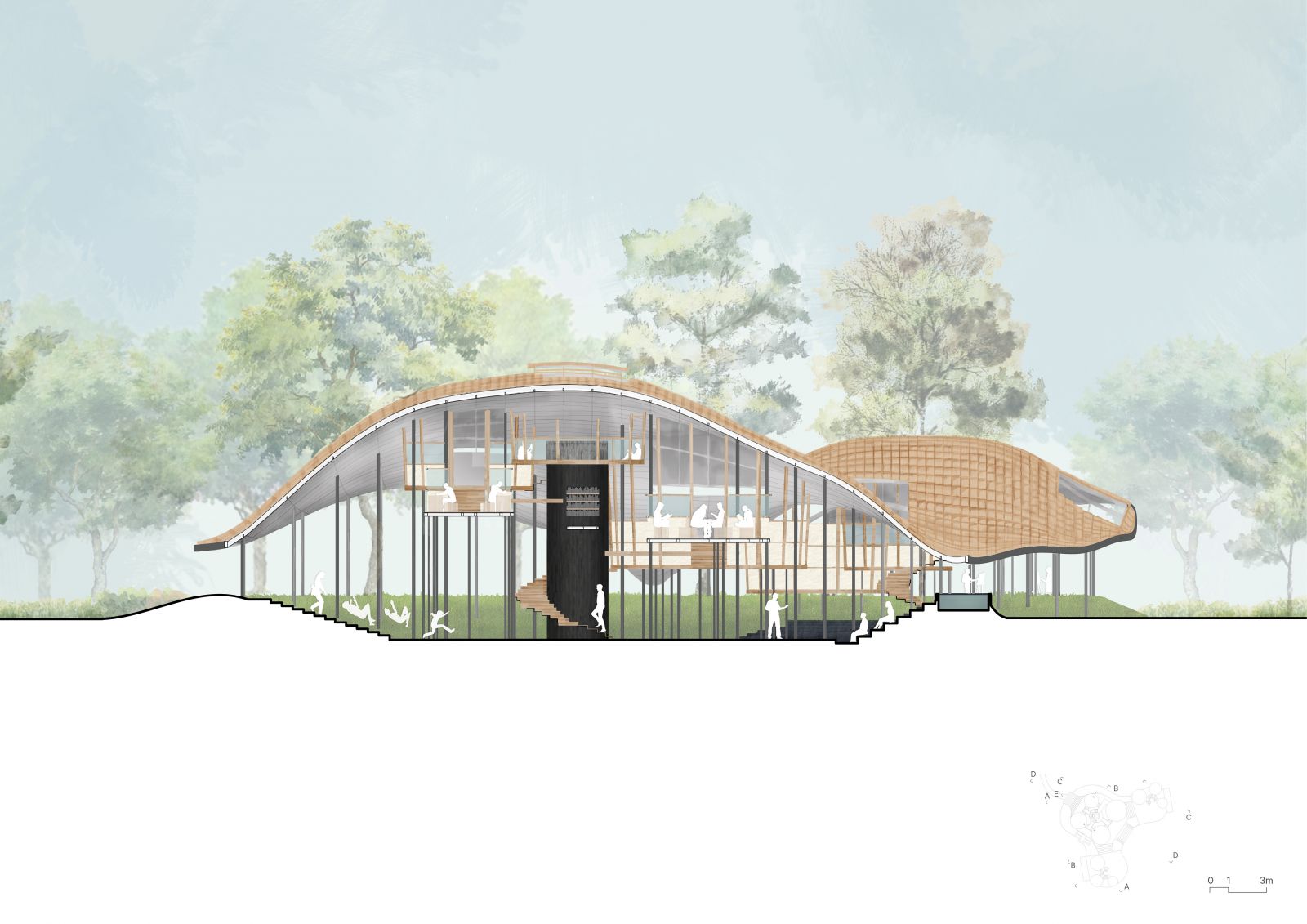
SECTION DD: The section shows materiality, context and the way the ground and other spaces are used.

MODEL: The photographs show different views from inside the model to give a sense of the experiential qualities of the spaces. The plan photographs show the space with and without the roof.